Your graphics add a nice touch to my presentations and I recently used them for one of my all-hands meetings. Your toolbox adds professionalism to my slides. Instead of using standard clipart.
Claude Jones, Director of Engineer, @Walmartlabs, USA
Your graphics add a nice touch to my presentations and I recently used them for one of my all-hands meetings. Your toolbox adds professionalism to my slides. Instead of using standard clipart.
Claude Jones, Director of Engineer, @Walmartlabs, USA
I needed a fresh look at some of my slides. I've tried to find a way to create a paintbrush effect, to underline, accentuate, add some color and the handwritten markers were just the things. Very easy to use, easy to size, change the color. It was an affordable, perfect solution and I'm happy to recommend it.
Anonymous, US
The crisp, clean look of the graphics, and the fact that it allowed me to easily edit and change the colors to match the template was my main reason for purchasing them.
Brandie Jenkins, E-learning Developer, USA
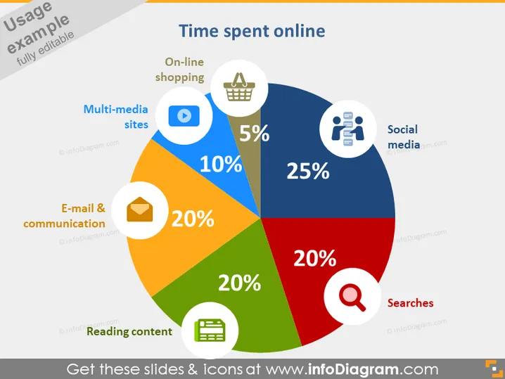
Die Folie präsentiert ein farbenfrohes Tortendiagramm, das die Verteilung der Zeit einer Person, die online verbracht wird, über verschiedene Aktivitäten veranschaulicht. Soziale Medien dominieren mit 25 %, was darauf hindeutet, dass ein erheblicher Teil der Zeit wahrscheinlich für Plattformen wie Facebook oder Twitter genutzt wird. Das Lesen von Inhalten sowie E-Mail und Kommunikation nehmen jeweils 20 % ein und heben die Bedeutung des Konsums von Informationen und digitaler Kommunikation im Online-Verhalten hervor. Suchanfragen machen weitere 20 % aus, was die häufige Nutzung von Suchmaschinen zur Informationsbeschaffung zeigt. Online-Einkäufe und Multimedia-Websites nehmen mit 5 % bzw. 10 % kleinere Anteile ein, was darauf hindeutet, dass im Vergleich zu anderen Aktivitäten weniger Zeit für E-Commerce und Unterhaltung aufgewendet wird.


