Your graphics add a nice touch to my presentations and I recently used them for one of my all-hands meetings. Your toolbox adds professionalism to my slides. Instead of using standard clipart.
Claude Jones, Director of Engineer, @Walmartlabs, USA
Your graphics add a nice touch to my presentations and I recently used them for one of my all-hands meetings. Your toolbox adds professionalism to my slides. Instead of using standard clipart.
Claude Jones, Director of Engineer, @Walmartlabs, USA
I needed a fresh look at some of my slides. I've tried to find a way to create a paintbrush effect, to underline, accentuate, add some color and the handwritten markers were just the things. Very easy to use, easy to size, change the color. It was an affordable, perfect solution and I'm happy to recommend it.
Anonymous, US
The crisp, clean look of the graphics, and the fact that it allowed me to easily edit and change the colors to match the template was my main reason for purchasing them.
Brandie Jenkins, E-learning Developer, USA
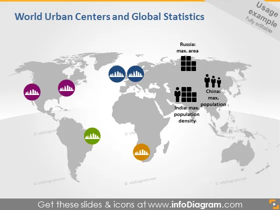
Die Folie bietet eine visuelle Darstellung globaler Statistiken zu städtischen Zentren und demographischen Daten. Sie zeigt Symbole, die die maximalen Flächen für Russland, die maximale Bevölkerung für China und die höchste Bevölkerungsdichte für Indien anzeigen, jeweils begleitet von einem eigenen Balkendiagramm. Die Balkendiagramme repräsentieren unterschiedliche Größenordnungen quantitativer Daten und verknüpfen visuelle Elemente mit realen geografischen und demografischen Statistiken.
Die Folie hat ein sauberes und modernes Design, das farblich kodierte Elemente zur klaren Unterscheidung zwischen verschiedenen Datenpunkten verwendet.


