Your graphics add a nice touch to my presentations and I recently used them for one of my all-hands meetings. Your toolbox adds professionalism to my slides. Instead of using standard clipart.
Claude Jones, Director of Engineer, @Walmartlabs, USA
Your graphics add a nice touch to my presentations and I recently used them for one of my all-hands meetings. Your toolbox adds professionalism to my slides. Instead of using standard clipart.
Claude Jones, Director of Engineer, @Walmartlabs, USA
I needed a fresh look at some of my slides. I've tried to find a way to create a paintbrush effect, to underline, accentuate, add some color and the handwritten markers were just the things. Very easy to use, easy to size, change the color. It was an affordable, perfect solution and I'm happy to recommend it.
Anonymous, US
The crisp, clean look of the graphics, and the fact that it allowed me to easily edit and change the colors to match the template was my main reason for purchasing them.
Brandie Jenkins, E-learning Developer, USA
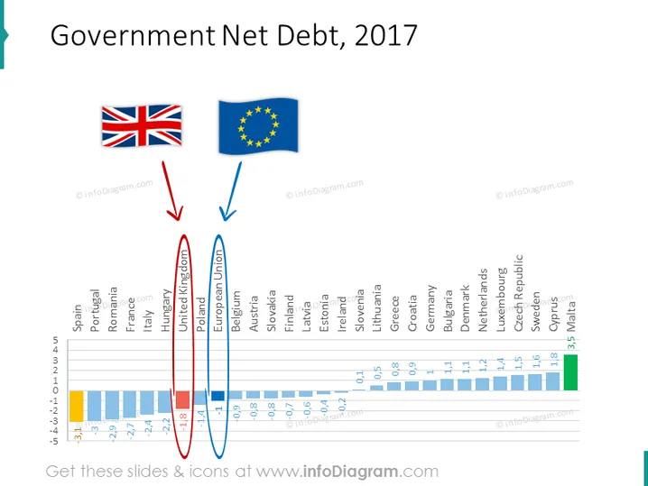
Die Folie mit dem Titel "Staatliche Nettoverschuldung, 2017" zeigt ein Balkendiagramm, das die Nettoverschuldung als Prozentsatz des BIP für verschiedene europäische Länder vergleicht. Das Vereinigte Königreich wird mit einem roten Oval hervorgehoben und ist durch ein Flaggen-Icon und einen nach unten zeigenden Pfeil gekennzeichnet, was auf ein relativ hohes Schuldenniveau hinweist. Im Gegensatz dazu wird die Europäische Union in Blau umrandet und ebenfalls durch ihre Flagge gekennzeichnet, was im Durchschnitt ein niedrigeres Schuldenniveau zeigt. Jeder Balken im Diagramm repräsentiert ein anderes Land, wobei die y-Achse den Nettoverschuldungsprozentsatz und die x-Achse die Ländernamen anzeigt.
Die Folie ist hauptsächlich in Blautönen gehalten, mit roten Akzenten, die zur Hervorhebung wichtiger Datenpunkte verwendet werden. Es gibt ein Gleichgewicht zwischen visuellen Elementen wie Flaggen, Pfeilen und Ovals sowie den informativen Inhalten, die im Balkendiagramm angezeigt werden.


