Your graphics add a nice touch to my presentations and I recently used them for one of my all-hands meetings. Your toolbox adds professionalism to my slides. Instead of using standard clipart.
Claude Jones, Director of Engineer, @Walmartlabs, USA
Your graphics add a nice touch to my presentations and I recently used them for one of my all-hands meetings. Your toolbox adds professionalism to my slides. Instead of using standard clipart.
Claude Jones, Director of Engineer, @Walmartlabs, USA
I needed a fresh look at some of my slides. I've tried to find a way to create a paintbrush effect, to underline, accentuate, add some color and the handwritten markers were just the things. Very easy to use, easy to size, change the color. It was an affordable, perfect solution and I'm happy to recommend it.
Anonymous, US
The crisp, clean look of the graphics, and the fact that it allowed me to easily edit and change the colors to match the template was my main reason for purchasing them.
Brandie Jenkins, E-learning Developer, USA
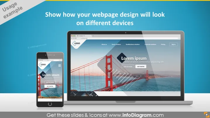
Die PowerPoint-Folie ist dazu gedacht, Präsentatoren zu helfen, zu demonstrieren, wie sich ein Webseitendesign auf verschiedenen Geräten wie Mobiltelefonen, Tablets und Desktop-Computern anpasst. Dies stellt sicher, dass das Publikum das responsive Design und die Benutzererfahrung visuell nachvollziehen kann. Die Folie betont die Bedeutung einer Webseite, die visuell konsistent und benutzerfreundlich ist, unabhängig vom verwendeten Gerät, und hebt das Konzept des responsiven Designs hervor.
Die Folie präsentiert ein sauberes und modernes Aussehen, mit einer gut ausgewogenen Anordnung von Text und visuellen Elementen. Die grafischen Darstellungen der Geräte erleichtern einen visuellen Vergleich, wie sich eine Webseite an verschiedene Bildschirmgrößen anpasst.