Your graphics add a nice touch to my presentations and I recently used them for one of my all-hands meetings. Your toolbox adds professionalism to my slides. Instead of using standard clipart.
Claude Jones, Director of Engineer, @Walmartlabs, USA
Your graphics add a nice touch to my presentations and I recently used them for one of my all-hands meetings. Your toolbox adds professionalism to my slides. Instead of using standard clipart.
Claude Jones, Director of Engineer, @Walmartlabs, USA
I needed a fresh look at some of my slides. I've tried to find a way to create a paintbrush effect, to underline, accentuate, add some color and the handwritten markers were just the things. Very easy to use, easy to size, change the color. It was an affordable, perfect solution and I'm happy to recommend it.
Anonymous, US
The crisp, clean look of the graphics, and the fact that it allowed me to easily edit and change the colors to match the template was my main reason for purchasing them.
Brandie Jenkins, E-learning Developer, USA
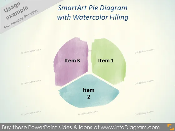
Die Folie präsentiert ein SmartArt-Kreisdiagramm mit drei Segmenten, die als Element 1, Element 2 und Element 3 bezeichnet sind, die jeweils mit einer Aquarelltextur gefüllt sind, die einen sanften und künstlerischen Ansatz zur Präsentation von Daten anzeigt. Element 1 könnte den größten Teil der Daten darstellen, dargestellt in Grün, gefolgt von Element 3 in Lila und Element 2 in Blau, was eine Rangordnung oder Verteilung von Elementen in einem Datensatz oder Aspekten eines Unternehmens andeutet.
Das Gesamtbild der Folie ist künstlerisch und weich, mit einer sanften Farbpalette, die die traditionelle Strenge von Unternehmensgrafiken vermeidet. Der Aquarelleffekt verleiht der Datenpräsentation eine kreative und informelle Note.


