

Your graphics add a nice touch to my presentations and I recently used them for one of my all-hands meetings. Your toolbox adds professionalism to my slides. Instead of using standard clipart.
Claude Jones, Director of Engineer, @Walmartlabs, USA

Your graphics add a nice touch to my presentations and I recently used them for one of my all-hands meetings. Your toolbox adds professionalism to my slides. Instead of using standard clipart.
Claude Jones, Director of Engineer, @Walmartlabs, USA
I needed a fresh look at some of my slides. I've tried to find a way to create a paintbrush effect, to underline, accentuate, add some color and the handwritten markers were just the things. Very easy to use, easy to size, change the color. It was an affordable, perfect solution and I'm happy to recommend it.
Anonymous, US
The crisp, clean look of the graphics, and the fact that it allowed me to easily edit and change the colors to match the template was my main reason for purchasing them.
Brandie Jenkins, E-learning Developer, USA
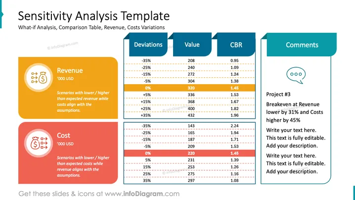
Die Folie trägt den Titel "Sensitivitätsanalyse Vorlage" und zeigt eine Vergleichstabelle für Umsatz- und Kostenvariationen in verschiedenen Szenarien. Sie bietet eine Was-wäre-wenn-Analyse, mit zwei Abschnitten für Umsatz und Kosten, die jeweils erklären, dass die Szenarien zu niedrigeren oder höheren Werten als erwartet führen können, wobei das andere Element (Kosten oder Umsatz) zu den Annahmen passt. Die Spalte Abweichungen listet prozentuale Änderungen von -35% bis +35% auf, mit entsprechenden Werten in '000 USD und einer CBR (möglicherweise einem Verhältnis oder einer Kennzahl) Spalte. Der Kommentarbereich enthält ein Sprechblasen-Symbol, das einen Platz für Erzählungen oder Anmerkungen anzeigt, wie z.B. Kommentare zu Projekt #3, Gewinnschwellen oder andere Details. Jede Szenariozeile hat zusätzlichen erläuternden Text, der beschreibt, was die prozentuale Abweichung für die Finanzen des Unternehmens bedeutet.



