Your graphics add a nice touch to my presentations and I recently used them for one of my all-hands meetings. Your toolbox adds professionalism to my slides. Instead of using standard clipart.
Claude Jones, Director of Engineer, @Walmartlabs, USA
Your graphics add a nice touch to my presentations and I recently used them for one of my all-hands meetings. Your toolbox adds professionalism to my slides. Instead of using standard clipart.
Claude Jones, Director of Engineer, @Walmartlabs, USA
I needed a fresh look at some of my slides. I've tried to find a way to create a paintbrush effect, to underline, accentuate, add some color and the handwritten markers were just the things. Very easy to use, easy to size, change the color. It was an affordable, perfect solution and I'm happy to recommend it.
Anonymous, US
The crisp, clean look of the graphics, and the fact that it allowed me to easily edit and change the colors to match the template was my main reason for purchasing them.
Brandie Jenkins, E-learning Developer, USA
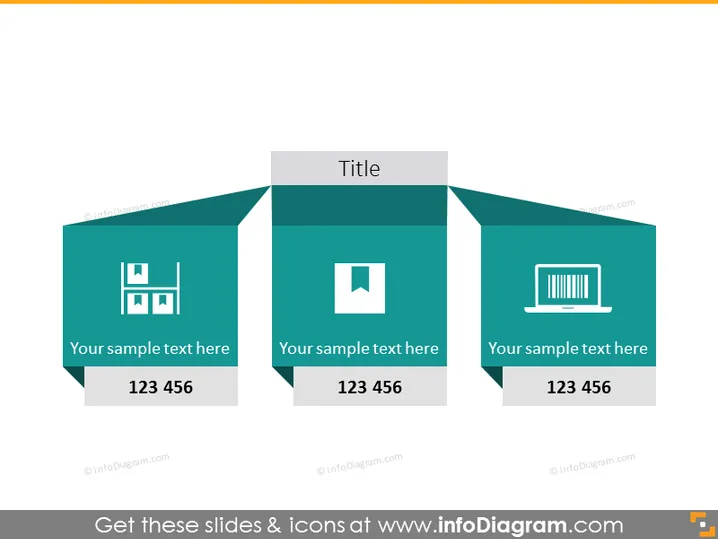
Die präsentierte PowerPoint-Folie ist ein Vergleichsdiagramm mit drei Abschnitten, das dazu dient, verschiedene Elemente oder Ideen zu beschreiben. Jeder Abschnitt enthält ein Symbol, das das besprochene Konzept darstellt. Zum Beispiel könnte das Symbol von Balken Wachstum oder Statistiken symbolisieren, ein Quadrat innerhalb eines Quadrats könnte Schichten oder Struktur darstellen, und das Laptop-Symbol könnte Technologie oder Computer darstellen. Jeder Abschnitt hat einen Platzhaltertext "Ihr Mustertext hier" gefolgt von einer Zahlenfolge "123 456", die angibt, wo spezifische Beschreibungen oder Daten eingefügt werden sollten.
Die gesamte visuelle Ästhetik ist schlank und modern, mit einem professionellen Aussehen, das durch die konsistente Farbpalette und saubere Grafiken vermittelt wird. Die Verwendung von geometrischen Formen und Symbolen verleiht der Folie ein strukturiertes, organisiertes Gefühl.


