Your graphics add a nice touch to my presentations and I recently used them for one of my all-hands meetings. Your toolbox adds professionalism to my slides. Instead of using standard clipart.
Claude Jones, Director of Engineer, @Walmartlabs, USA
Your graphics add a nice touch to my presentations and I recently used them for one of my all-hands meetings. Your toolbox adds professionalism to my slides. Instead of using standard clipart.
Claude Jones, Director of Engineer, @Walmartlabs, USA
I needed a fresh look at some of my slides. I've tried to find a way to create a paintbrush effect, to underline, accentuate, add some color and the handwritten markers were just the things. Very easy to use, easy to size, change the color. It was an affordable, perfect solution and I'm happy to recommend it.
Anonymous, US
The crisp, clean look of the graphics, and the fact that it allowed me to easily edit and change the colors to match the template was my main reason for purchasing them.
Brandie Jenkins, E-learning Developer, USA
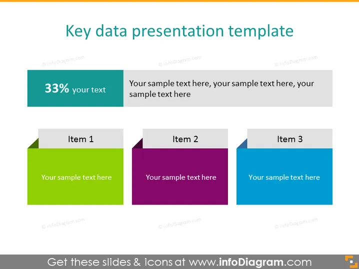
Die Folie trägt den Titel "Vorlage für die Präsentation von Schlüssel-Daten" und scheint eine Methode zur visuellen Darstellung von Schlüssel-Datenpunkten oder Fortschrittskennzahlen zu präsentieren. Es gibt drei farbige quadratische Grafiken, jede mit einer Überschrift "Punkt 1," "Punkt 2," und "Punkt 3," was darauf hindeutet, dass es Platz gibt, um individuelle Datenpunkte oder Konzepte einzugeben. Jede dieser Grafiken ist mit einem Platzhaltertext versehen, der angibt, wo beschreibenden Text hinzugefügt werden soll. Darüber hinaus steht auf der linken Seite ein türkisfarbener Rechteck "33%" mit einer Unterüberschrift "Ihr Text," was auf einen Raum für eine Statistik oder eine Schlüsselzahl mit zugehörigen Details hinweist.
Die PowerPoint-Folie zeigt ein professionelles und sauberes Design. Der Einsatz von Farbverläufen und deutliche Trennung der Elemente sorgt für Klarheit und visuelle Anziehung.


