Your graphics add a nice touch to my presentations and I recently used them for one of my all-hands meetings. Your toolbox adds professionalism to my slides. Instead of using standard clipart.
Claude Jones, Director of Engineer, @Walmartlabs, USA
Your graphics add a nice touch to my presentations and I recently used them for one of my all-hands meetings. Your toolbox adds professionalism to my slides. Instead of using standard clipart.
Claude Jones, Director of Engineer, @Walmartlabs, USA
I needed a fresh look at some of my slides. I've tried to find a way to create a paintbrush effect, to underline, accentuate, add some color and the handwritten markers were just the things. Very easy to use, easy to size, change the color. It was an affordable, perfect solution and I'm happy to recommend it.
Anonymous, US
The crisp, clean look of the graphics, and the fact that it allowed me to easily edit and change the colors to match the template was my main reason for purchasing them.
Brandie Jenkins, E-learning Developer, USA
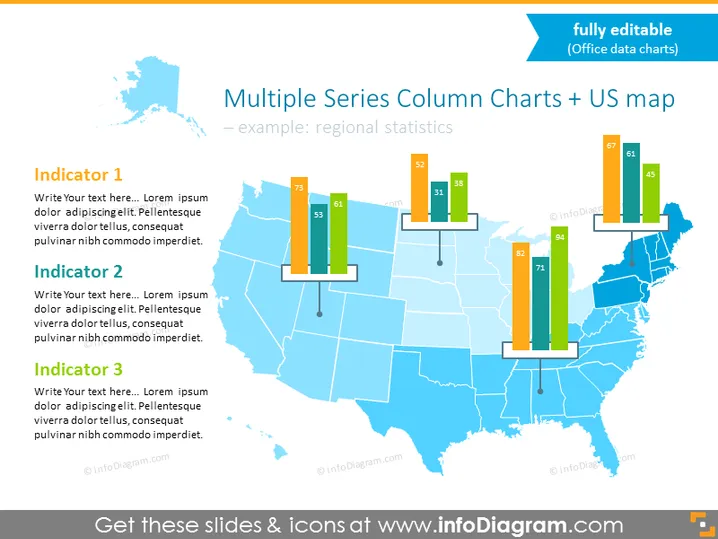
Die Folie mit dem Titel "Mehrere Serien Säulendiagramme + US-Karte" zeigt regionale Statistiken durch eine visuelle Darstellung von Daten. Es ist ein Beispiel dafür, wie man vergleichende Informationen für verschiedene Regionen in den Vereinigten Staaten darstellen kann. drei "Indikatoren" schlagen Kategorien für den Vergleich vor, mit Platzhaltertext für zusätzliche Details. Jeder Indikator könnte eine spezifische Kennzahl beschreiben, wie wirtschaftliche Daten, Bevölkerungsstatistiken oder Gesundheitsindizes, und bietet eine schnelle visuelle Bewertung der regionalen Leistung oder des Status in diesen Kennzahlen.
Die Folie hat ein sauberes, professional Design mit einer klaren visuellen Unterscheidung zwischen Datenpunkten. Der Einsatz von Farben und die Anordnung der Säulendiagramme auf der Karte ermöglicht einen intuitiven Vergleich der verschiedenen Statistiken zwischen den Staaten.


