Your graphics add a nice touch to my presentations and I recently used them for one of my all-hands meetings. Your toolbox adds professionalism to my slides. Instead of using standard clipart.
Claude Jones, Director of Engineer, @Walmartlabs, USA
Your graphics add a nice touch to my presentations and I recently used them for one of my all-hands meetings. Your toolbox adds professionalism to my slides. Instead of using standard clipart.
Claude Jones, Director of Engineer, @Walmartlabs, USA
I needed a fresh look at some of my slides. I've tried to find a way to create a paintbrush effect, to underline, accentuate, add some color and the handwritten markers were just the things. Very easy to use, easy to size, change the color. It was an affordable, perfect solution and I'm happy to recommend it.
Anonymous, US
The crisp, clean look of the graphics, and the fact that it allowed me to easily edit and change the colors to match the template was my main reason for purchasing them.
Brandie Jenkins, E-learning Developer, USA
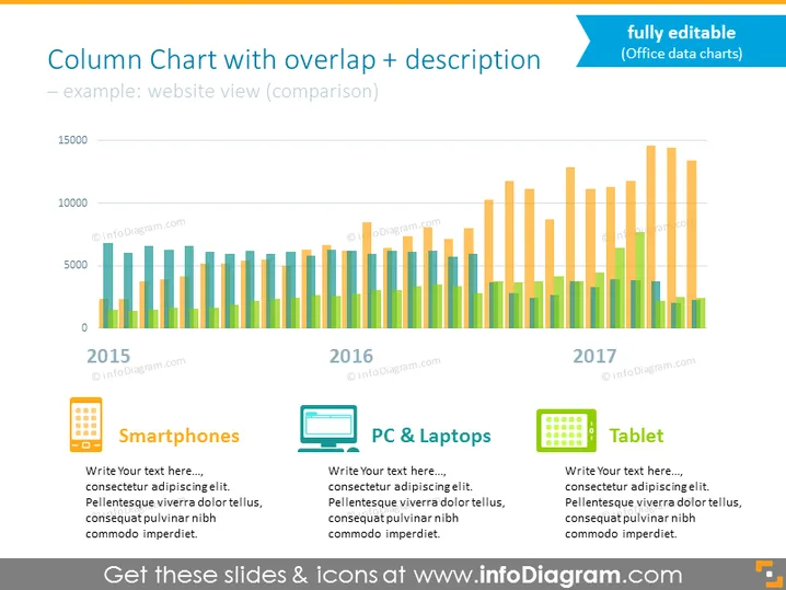
Dieses datengestützte Excel-Diagramm präsentiert Statistiken für 3 Gerätekategorien: Smartphones, PCs & Laptops sowie Tablets in Form eines überlappendes Balkendiagramms. Diskutieren Sie Ergebnisse aus über 2 Jahren mit einem Balkendiagramm, das Beschreibungen und elegante flache Icons zeigt, die die analysierten Gruppen veranschaulichen. Passen Sie die Farben dieser Folie einfach an den visuellen Stil Ihrer Präsentation an.
Dieses Spaltenbalken Selbstmacher-Diagramm mit Datenbeschreibung ist Teil unserer Flat Data-Driven Presentation Charts PPT-Vorlage.


