Your graphics add a nice touch to my presentations and I recently used them for one of my all-hands meetings. Your toolbox adds professionalism to my slides. Instead of using standard clipart.
Claude Jones, Director of Engineer, @Walmartlabs, USA
Your graphics add a nice touch to my presentations and I recently used them for one of my all-hands meetings. Your toolbox adds professionalism to my slides. Instead of using standard clipart.
Claude Jones, Director of Engineer, @Walmartlabs, USA
I needed a fresh look at some of my slides. I've tried to find a way to create a paintbrush effect, to underline, accentuate, add some color and the handwritten markers were just the things. Very easy to use, easy to size, change the color. It was an affordable, perfect solution and I'm happy to recommend it.
Anonymous, US
The crisp, clean look of the graphics, and the fact that it allowed me to easily edit and change the colors to match the template was my main reason for purchasing them.
Brandie Jenkins, E-learning Developer, USA
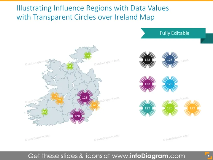
Die PowerPoint-Folie präsentiert eine Visualisierung von Einflussregionen in ganz Irland unter Verwendung transparenter Kreise mit begleitenden Datenwerten. Transparente Kreise unterschiedlicher Größen sind über eine Umrisskarte von Irland platziert, um verschiedene Ebenen von Einfluss oder Datenpunkten darzustellen, wobei größere Kreise Regionen mit größerem Einfluss oder höheren Datenwerten anzeigen. Jeder Kreis enthält eine Zahl, die den Datenwert für diese Region angibt, wie "57", "74", "125" usw. Diese visuelle Darstellung ermöglicht einen klaren Vergleich regionaler Daten auf einen Blick.
Die Folie hat ein sauberes, professionelles Aussehen, wobei die Karte und die transparenten Kreise ein informatives und leicht verständliches Hilfsmittel bieten. Die Farbcodierung und die Größenvariation der Kreise helfen dabei, schnell die Unterschiede der regionalen Daten zu vermitteln.


