Your graphics add a nice touch to my presentations and I recently used them for one of my all-hands meetings. Your toolbox adds professionalism to my slides. Instead of using standard clipart.
Claude Jones, Director of Engineer, @Walmartlabs, USA
Your graphics add a nice touch to my presentations and I recently used them for one of my all-hands meetings. Your toolbox adds professionalism to my slides. Instead of using standard clipart.
Claude Jones, Director of Engineer, @Walmartlabs, USA
I needed a fresh look at some of my slides. I've tried to find a way to create a paintbrush effect, to underline, accentuate, add some color and the handwritten markers were just the things. Very easy to use, easy to size, change the color. It was an affordable, perfect solution and I'm happy to recommend it.
Anonymous, US
The crisp, clean look of the graphics, and the fact that it allowed me to easily edit and change the colors to match the template was my main reason for purchasing them.
Brandie Jenkins, E-learning Developer, USA
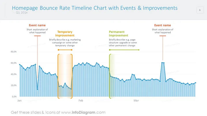
PowerPoint-Zeitachdiagramm geeignet für eine eingehende Analyse der Absprungrate der Startseite, einschließlich wichtiger Ereignisse, temporärer Verbesserungen und dauerhafte Verbesserungen. Veranschaulichen Sie das Verhalten der Benutzer über die folgenden Monate und notieren Sie wesentliche Änderungen, um sie mit Ihrem Team oder Ihren Kunden zu besprechen.
Dieses Zeitachdiagramm zur Absprungrate mit Ereignissen und Verbesserungen ist Teil unserer PPT-Vorlage für Web-Analyseberichte.


