Your graphics add a nice touch to my presentations and I recently used them for one of my all-hands meetings. Your toolbox adds professionalism to my slides. Instead of using standard clipart.
Claude Jones, Director of Engineer, @Walmartlabs, USA
Your graphics add a nice touch to my presentations and I recently used them for one of my all-hands meetings. Your toolbox adds professionalism to my slides. Instead of using standard clipart.
Claude Jones, Director of Engineer, @Walmartlabs, USA
I needed a fresh look at some of my slides. I've tried to find a way to create a paintbrush effect, to underline, accentuate, add some color and the handwritten markers were just the things. Very easy to use, easy to size, change the color. It was an affordable, perfect solution and I'm happy to recommend it.
Anonymous, US
The crisp, clean look of the graphics, and the fact that it allowed me to easily edit and change the colors to match the template was my main reason for purchasing them.
Brandie Jenkins, E-learning Developer, USA
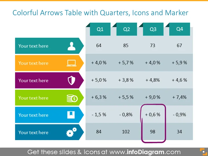
Die PowerPoint-Folie mit dem Titel "Bunte Pfeile Tabelle mit Quartalen, Symbolen und Markierungen" präsentiert einen Datenvergleich über vier Quartale (Q1, Q2, Q3, Q4) und zeigt prozentuale Veränderungen sowie numerische Werte für jedes Quartal. Die Folie enthält fünf horizontale Reihen, die jeweils mit einer anderen Farbe, einem Symbol und einem Textplatzhalter verbunden sind, um verschiedene Datenpunkte oder Kennzahlen darzustellen, die verglichen werden. Die Reihen heben positive und negative Wachstumstrends hervor, mit entsprechenden Auf- und Abwärtspfeilen, wobei einer der Datenpunkte in Q3 von einem lila Marker umgeben ist, um darauf aufmerksam zu machen.
Das Gesamtbild der Folie ist bunt und visuell ansprechend mit einem intuitiven Layout zur Präsentation vergleichender Daten. Sie verwendet effektive visuelle Hinweise wie Symbole und Farbcode, um die Informationsverarbeitung zu vereinfachen.


