

Your graphics add a nice touch to my presentations and I recently used them for one of my all-hands meetings. Your toolbox adds professionalism to my slides. Instead of using standard clipart.
Claude Jones, Director of Engineer, @Walmartlabs, USA

Your graphics add a nice touch to my presentations and I recently used them for one of my all-hands meetings. Your toolbox adds professionalism to my slides. Instead of using standard clipart.
Claude Jones, Director of Engineer, @Walmartlabs, USA
I needed a fresh look at some of my slides. I've tried to find a way to create a paintbrush effect, to underline, accentuate, add some color and the handwritten markers were just the things. Very easy to use, easy to size, change the color. It was an affordable, perfect solution and I'm happy to recommend it.
Anonymous, US
The crisp, clean look of the graphics, and the fact that it allowed me to easily edit and change the colors to match the template was my main reason for purchasing them.
Brandie Jenkins, E-learning Developer, USA
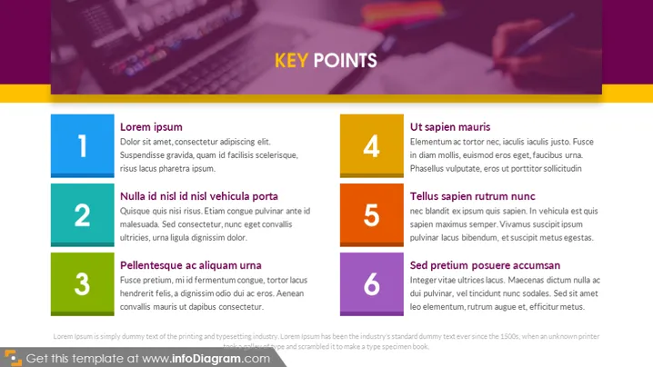
Die Folie scheint eine Liste von sechs wichtigen Punkten darzustellen, von denen jeder eine kurze Erklärung enthält, um das Konzept näher zu erläutern. Die Punkte sind einfach mit "Lorem ipsum," "Nulla id nisl id nisl vehicula porta," "Pellentesque ac aliquam urna," "Ut sapien mauris," "Tellus sapien rutrum nunc," und "Sed pretium posuere accumsan" betitelt. Diese Namen deuten auf Platzhaltertext hin und nicht auf tatsächlichen Inhalt, was eine gängige Praxis in der Entwurfsphase des Präsentationsdesigns ist, um das Layout und Design zu überprüfen, bevor der Text finalisiert wird.
Der visuelle Stil nutzt Kontrast sowohl in der Farbe als auch in der Größe der Elemente, um die Aufmerksamkeit auf die wichtigen Punkte zu lenken. Das Farbschema ist konsistent, und die gesamte Ästhetik fühlt sich professionell und zeitgemäß an.



