Your graphics add a nice touch to my presentations and I recently used them for one of my all-hands meetings. Your toolbox adds professionalism to my slides. Instead of using standard clipart.
Claude Jones, Director of Engineer, @Walmartlabs, USA
Your graphics add a nice touch to my presentations and I recently used them for one of my all-hands meetings. Your toolbox adds professionalism to my slides. Instead of using standard clipart.
Claude Jones, Director of Engineer, @Walmartlabs, USA
I needed a fresh look at some of my slides. I've tried to find a way to create a paintbrush effect, to underline, accentuate, add some color and the handwritten markers were just the things. Very easy to use, easy to size, change the color. It was an affordable, perfect solution and I'm happy to recommend it.
Anonymous, US
The crisp, clean look of the graphics, and the fact that it allowed me to easily edit and change the colors to match the template was my main reason for purchasing them.
Brandie Jenkins, E-learning Developer, USA
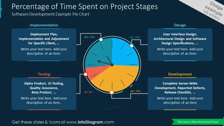
Diese PowerPoint-Folienvorlage bietet eine klare und prägnante Visualisierung des Prozentsatzes der auf verschiedene Phasen eines Softwareentwicklungsprojekts verwendeten Zeit. Das Kreisdiagramm kommuniziert effektiv das relative Verhältnis der für jede Phase zugewiesenen Zeit und macht es zu einem wertvollen Werkzeug für Projektplanung, Fortschrittsverfolgung und Präsentationen im Ressourcenmanagement. Die bearbeitbaren Funktionen der Vorlage ermöglichen eine Anpassung an spezifische Projektdaten und Präsentationsbedürfnisse.


