

Your graphics add a nice touch to my presentations and I recently used them for one of my all-hands meetings. Your toolbox adds professionalism to my slides. Instead of using standard clipart.
Claude Jones, Director of Engineer, @Walmartlabs, USA

Your graphics add a nice touch to my presentations and I recently used them for one of my all-hands meetings. Your toolbox adds professionalism to my slides. Instead of using standard clipart.
Claude Jones, Director of Engineer, @Walmartlabs, USA
I needed a fresh look at some of my slides. I've tried to find a way to create a paintbrush effect, to underline, accentuate, add some color and the handwritten markers were just the things. Very easy to use, easy to size, change the color. It was an affordable, perfect solution and I'm happy to recommend it.
Anonymous, US
The crisp, clean look of the graphics, and the fact that it allowed me to easily edit and change the colors to match the template was my main reason for purchasing them.
Brandie Jenkins, E-learning Developer, USA
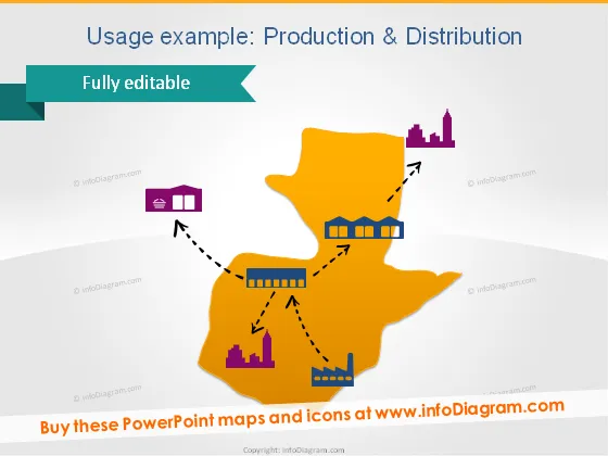
Die Folie veranschaulicht das Konzept der Produktion und Distribution im geografischen Kontext mithilfe einer stilisierten Karte und Icons. Die Karte scheint eine abstrakte Region darzustellen, mit Verbindungen zwischen einer Fabrik, einem Lager und einem Säulendiagramm, das Leistungskennzahlen anzeigt. Jedes Icon (Fabrik, Lager und Leistungsdiagramm) symbolisiert eine Phase oder Komponente im Produktions- und Verteilungsprozess. Die Fabrik repräsentiert wahrscheinlich die Produktionsphase, das Lager steht für Lagerung oder Logistik, und das Säulendiagramm kann Verkaufs- oder Verteilungsergebnisse anzeigen.
Das Gesamtbild der Folie ist modern und geschäftsmäßig, mit einer einfachen, aber auffälligen Farbpalette, die Aufmerksamkeit erregt. Die Verwendung von klaren Formen und Icons macht die Folie auf den ersten Blick leicht verständlich.



