Your graphics add a nice touch to my presentations and I recently used them for one of my all-hands meetings. Your toolbox adds professionalism to my slides. Instead of using standard clipart.
Claude Jones, Director of Engineer, @Walmartlabs, USA
Your graphics add a nice touch to my presentations and I recently used them for one of my all-hands meetings. Your toolbox adds professionalism to my slides. Instead of using standard clipart.
Claude Jones, Director of Engineer, @Walmartlabs, USA
I needed a fresh look at some of my slides. I've tried to find a way to create a paintbrush effect, to underline, accentuate, add some color and the handwritten markers were just the things. Very easy to use, easy to size, change the color. It was an affordable, perfect solution and I'm happy to recommend it.
Anonymous, US
The crisp, clean look of the graphics, and the fact that it allowed me to easily edit and change the colors to match the template was my main reason for purchasing them.
Brandie Jenkins, E-learning Developer, USA
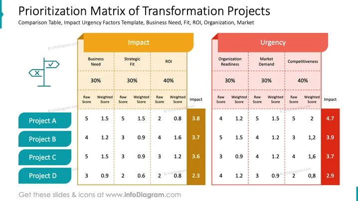
Die Folie zeigt eine Priorisierungs-Matrix, die sich auf die Auswirkungen und die Dringlichkeit von Transformationsprojekten konzentriert. Sie wird verwendet, um Projekte (A, B, C, D) basierend auf bestimmten Kriterien innerhalb von zwei Hauptkategorien zu bewerten und zu vergleichen: Auswirkungen und Dringlichkeit. Die Auswirkungen werden durch Geschäftsbedarf, strategische Passung und Kapitalrendite (ROI) bewertet, mit Gewichten von 30 %, 30 % und 40 %. Die Dringlichkeit wird durch die Bereitschaft der Organisation, die Marktnachfrage und die Wettbewerbsfähigkeit bewertet, ebenfalls mit Gewichten von 30 %, 30 % und 40 %. Jedes Projekt wird anhand dieser Kriterien bewertet, erhält eine Roh- und eine gewichtete Punktzahl, und eine Gesamtauswirkungsbewertung wird sowohl für die Auswirkungen als auch für die Dringlichkeit berechnet.
Die Folie hat ein harmonisches Farbschema mit kontrastierenden Farben, um verschiedene Aspekte der Matrix klar darzustellen. Der Gebrauch von Balken und Farben bietet eine schnelle visuelle Darstellung der Daten.


