

Your graphics add a nice touch to my presentations and I recently used them for one of my all-hands meetings. Your toolbox adds professionalism to my slides. Instead of using standard clipart.
Claude Jones, Director of Engineer, @Walmartlabs, USA

Your graphics add a nice touch to my presentations and I recently used them for one of my all-hands meetings. Your toolbox adds professionalism to my slides. Instead of using standard clipart.
Claude Jones, Director of Engineer, @Walmartlabs, USA
I needed a fresh look at some of my slides. I've tried to find a way to create a paintbrush effect, to underline, accentuate, add some color and the handwritten markers were just the things. Very easy to use, easy to size, change the color. It was an affordable, perfect solution and I'm happy to recommend it.
Anonymous, US
The crisp, clean look of the graphics, and the fact that it allowed me to easily edit and change the colors to match the template was my main reason for purchasing them.
Brandie Jenkins, E-learning Developer, USA
Leider enthält das Bild keinen Folientitel, auf den ich mich beziehen kann.
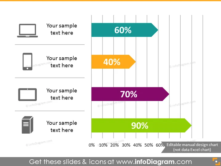
Die Folie scheint eine statistische Aufschlüsselung mithilfe von horizontalen Balkendiagrammen zu veranschaulichen, wobei jedes mit einem anderen Symbol und einer anderen Farbe assoziiert ist. Es listet Prozentsätze neben den Balken auf, die Leistung, Zufriedenheit oder ein anderes messbares Parameter anzeigen. Die spezifischen Details, wie das, was die Prozentsätze repräsentieren, die Bedeutung der Symbole und jeglicher entsprechender Beispieltext, sind Platzhalter und benötigen Kontext, um korrekt interpretiert zu werden.
Das Gesamterscheinungsbild der Folie ist modern und professionell, mit lebendigen Farben, die für die Balken verwendet werden, um die Datenpunkte klar zu unterscheiden. Sie präsentiert quantitative Informationen effizient auf eine Weise, die visuell leicht interpretierbar ist.



