

Your graphics add a nice touch to my presentations and I recently used them for one of my all-hands meetings. Your toolbox adds professionalism to my slides. Instead of using standard clipart.
Claude Jones, Director of Engineer, @Walmartlabs, USA

Your graphics add a nice touch to my presentations and I recently used them for one of my all-hands meetings. Your toolbox adds professionalism to my slides. Instead of using standard clipart.
Claude Jones, Director of Engineer, @Walmartlabs, USA
I needed a fresh look at some of my slides. I've tried to find a way to create a paintbrush effect, to underline, accentuate, add some color and the handwritten markers were just the things. Very easy to use, easy to size, change the color. It was an affordable, perfect solution and I'm happy to recommend it.
Anonymous, US
The crisp, clean look of the graphics, and the fact that it allowed me to easily edit and change the colors to match the template was my main reason for purchasing them.
Brandie Jenkins, E-learning Developer, USA
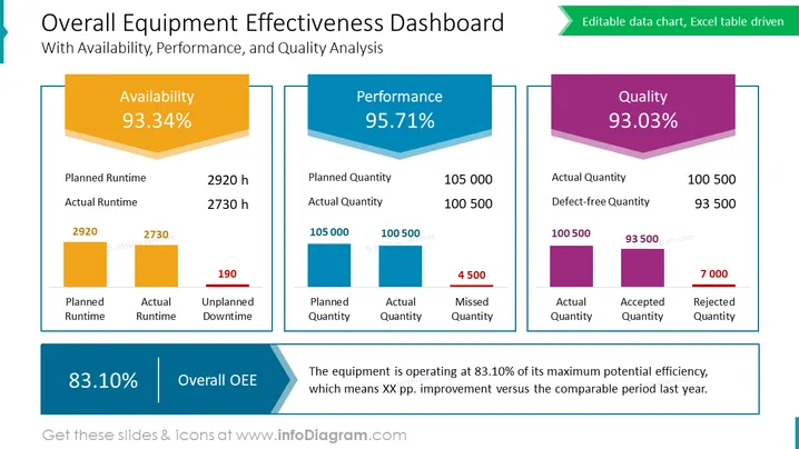
Die Folie präsentiert ein „Overall Equipment Effectiveness Dashboard“, das Kennzahlen für „Verfügbarkeit“, „Leistung“ und „Qualität“ mit Prozentsätzen von 93,34 %, 95,71 % bzw. 93,03 % hervorhebt. Jede Kennzahl beinhaltet eine tiefere Analyse mit Balkendiagrammen, die geplante gegenüber tatsächlichen Werten zeigen, und im Fall der Qualität, akzeptierte gegenüber abgelehnte Mengen. Die Kennzahlen sind indikativ für eine Fertigungs- oder Produktionsumgebung. Die gesamte OEE wird mit 83,10 % zusammengefasst, mit einer Anmerkung, die erklärt, dass die Anlage zu 83,10 % ihres maximalen Potenzials arbeitet und eine Verbesserung gegenüber dem letzten Jahr aufzeigt.
Das Foliendesign ist sauber und professionell strukturiert, mit einer starken visuellen Hierarchie, die den Betrachter durch die wichtigsten Leistungsindikatoren führt. Die Farbcodierung und die dreidimensionalen Balkendiagramme sorgen für eine visuell ansprechende Präsentation, die auf einen Blick leicht verständlich ist.



