Your graphics add a nice touch to my presentations and I recently used them for one of my all-hands meetings. Your toolbox adds professionalism to my slides. Instead of using standard clipart.
Claude Jones, Director of Engineer, @Walmartlabs, USA
Your graphics add a nice touch to my presentations and I recently used them for one of my all-hands meetings. Your toolbox adds professionalism to my slides. Instead of using standard clipart.
Claude Jones, Director of Engineer, @Walmartlabs, USA
I needed a fresh look at some of my slides. I've tried to find a way to create a paintbrush effect, to underline, accentuate, add some color and the handwritten markers were just the things. Very easy to use, easy to size, change the color. It was an affordable, perfect solution and I'm happy to recommend it.
Anonymous, US
The crisp, clean look of the graphics, and the fact that it allowed me to easily edit and change the colors to match the template was my main reason for purchasing them.
Brandie Jenkins, E-learning Developer, USA
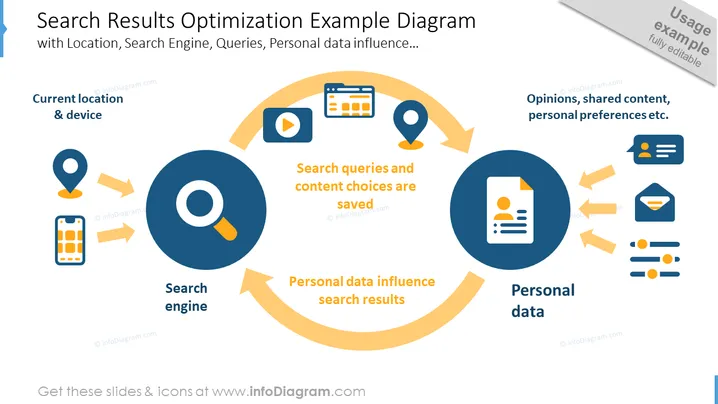
Die PowerPoint-Folie trägt den Titel "Beispiel-Diagramm zur Optimierung von Suchergebnissen" und diskutiert, wie Suchergebnisse basierend auf verschiedenen Faktoren wie Standort, Suchmaschinenanfragen und persönlichen Daten personalisiert werden. Die Folie stellt visuell einen Zyklus dar, der zeigt, wie der aktuelle Standort und das Gerät die Suchmaschine beeinflussen, die Suchanfragen und Inhaltsauswahlen speichert. Diese gespeicherten Entscheidungen prägen dann, wie persönliche Daten die Suchergebnisse beeinflussen, und vervollständigen einen Feedback-Zyklus, der Meinungen, geteilte Inhalte und persönliche Vorlieben umfasst.


