

Your graphics add a nice touch to my presentations and I recently used them for one of my all-hands meetings. Your toolbox adds professionalism to my slides. Instead of using standard clipart.
Claude Jones, Director of Engineer, @Walmartlabs, USA

Your graphics add a nice touch to my presentations and I recently used them for one of my all-hands meetings. Your toolbox adds professionalism to my slides. Instead of using standard clipart.
Claude Jones, Director of Engineer, @Walmartlabs, USA
I needed a fresh look at some of my slides. I've tried to find a way to create a paintbrush effect, to underline, accentuate, add some color and the handwritten markers were just the things. Very easy to use, easy to size, change the color. It was an affordable, perfect solution and I'm happy to recommend it.
Anonymous, US
The crisp, clean look of the graphics, and the fact that it allowed me to easily edit and change the colors to match the template was my main reason for purchasing them.
Brandie Jenkins, E-learning Developer, USA
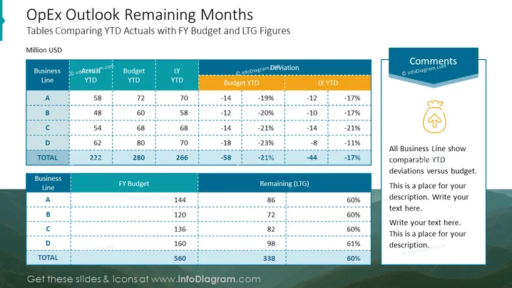
Die Folie zeigt einen Vergleich der aktuellen Ausgaben von Jahr bis heute (YTD) mit dem Gesamtjahresbudget (FY) und den Zahlen des letzten Jahres (LY) über verschiedene Geschäftsbereiche. Die Informationen sind in zwei Tabellen präsentiert: Die erste veranschaulicht die YTD-Werte im Vergleich zum Budget und zu den LY-Zahlen, wobei sowohl numerische als auch prozentuale Abweichungen angegeben werden. Die zweite Tabelle vergleicht das FY-Budget mit dem verbleibenden Budget, das als 'Verbleibend (LTG)' bezeichnet wird, und gibt einen Prozentsatz des verbleibenden Budgets an. Ein Kommentarteil deutet darauf hin, dass alle Geschäftsbereiche vergleichbare YTD-Abweichungen zum Budget aufweisen.
Die Folie hat ein sauberes und professionelles Aussehen, das sich auf die Datenpräsentation konzentriert, mit klaren Abgrenzungen zwischen den verschiedenen Abschnitten. Das Farbschema ist ausgewogen und kohärent, mit dem Einsatz von Blau- und Grüntönen, die ein Unternehmensgefühl vermitteln.



