Your graphics add a nice touch to my presentations and I recently used them for one of my all-hands meetings. Your toolbox adds professionalism to my slides. Instead of using standard clipart.
Claude Jones, Director of Engineer, @Walmartlabs, USA
Your graphics add a nice touch to my presentations and I recently used them for one of my all-hands meetings. Your toolbox adds professionalism to my slides. Instead of using standard clipart.
Claude Jones, Director of Engineer, @Walmartlabs, USA
I needed a fresh look at some of my slides. I've tried to find a way to create a paintbrush effect, to underline, accentuate, add some color and the handwritten markers were just the things. Very easy to use, easy to size, change the color. It was an affordable, perfect solution and I'm happy to recommend it.
Anonymous, US
The crisp, clean look of the graphics, and the fact that it allowed me to easily edit and change the colors to match the template was my main reason for purchasing them.
Brandie Jenkins, E-learning Developer, USA
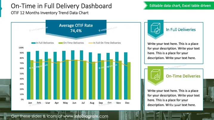
Die Folie trägt den Titel "On-Time in Full Delivery Dashboard" und zeigt den Untertitel "OTIF 12 Monate Lagertrend-Daten-Diagramm." Sie zeigt ein Balken- und Liniendiagramm mit den Leistungskennzahlen: Vollständige Lieferungen, pünktliche Lieferungen und vollständige pünktliche Lieferungen. Diese Kennzahlen dienen zur Verfolgung der Zuverlässigkeit und Effizienz einer Lieferkette oder eines Lieferdienstes. Die "Durchschnittliche OTIF-Rate" wird mit 74,4 % angezeigt und bietet einen Überblick über die Lieferleistung über einen Zeitraum von einem Jahr. Dies könnte die Liefergenauigkeit und Pünktlichkeit eines Unternehmens über ein Jahr hinweg widerspiegeln.
Die visuelle Komposition der Folie ist professionell und strukturiert, mit einem klaren Fokus auf das Diagramm. Der Einsatz von Farbe differenziert die Datenpunkte effektiv und der 3D-Effekt des Banners verleiht dem Design Tiefe.


