

Your graphics add a nice touch to my presentations and I recently used them for one of my all-hands meetings. Your toolbox adds professionalism to my slides. Instead of using standard clipart.
Claude Jones, Director of Engineer, @Walmartlabs, USA

Your graphics add a nice touch to my presentations and I recently used them for one of my all-hands meetings. Your toolbox adds professionalism to my slides. Instead of using standard clipart.
Claude Jones, Director of Engineer, @Walmartlabs, USA
I needed a fresh look at some of my slides. I've tried to find a way to create a paintbrush effect, to underline, accentuate, add some color and the handwritten markers were just the things. Very easy to use, easy to size, change the color. It was an affordable, perfect solution and I'm happy to recommend it.
Anonymous, US
The crisp, clean look of the graphics, and the fact that it allowed me to easily edit and change the colors to match the template was my main reason for purchasing them.
Brandie Jenkins, E-learning Developer, USA
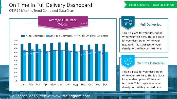
Diese PowerPoint-Folie trägt den Titel „On Time In Full Liefer-Dashboard“ und zeigt den kombinierten Datenchart des OTIF 12-Monats-Trends. Sie präsentiert ein Balken- und Liniendiagramm, das „In Full Deliveries“, „On Time Deliveries“ und deren Schnittmenge „In Full On Time Deliveries“ über die Monate von Januar bis Dezember hinweg verfolgt. Ein großes, prominentes Element hebt die „Durchschnittliche OTIF-Rate“ von 74,4 % hervor. Die Folie enthält Platzhalter für zusätzliche Texterklärungen unter den Überschriften „In Full Deliveries“ und „On Time Deliveries“, jeweils begleitet von einem entsprechenden Symbol, was darauf hindeutet, dass diese Abschnitte für anpassbare Beschreibungen vorgesehen sind.
Die Folie besticht durch eine klare, professionelle Ästhetik mit einem gut organisierten Layout, das die Aufmerksamkeit auf die Datenvisualisierung lenkt. Die Verwendung von farbigen Elementen und Symbolen erleichtert das schnelle Erfassen der Bedeutung und des Zwecks des Diagramms.



