Your graphics add a nice touch to my presentations and I recently used them for one of my all-hands meetings. Your toolbox adds professionalism to my slides. Instead of using standard clipart.
Claude Jones, Director of Engineer, @Walmartlabs, USA
Your graphics add a nice touch to my presentations and I recently used them for one of my all-hands meetings. Your toolbox adds professionalism to my slides. Instead of using standard clipart.
Claude Jones, Director of Engineer, @Walmartlabs, USA
I needed a fresh look at some of my slides. I've tried to find a way to create a paintbrush effect, to underline, accentuate, add some color and the handwritten markers were just the things. Very easy to use, easy to size, change the color. It was an affordable, perfect solution and I'm happy to recommend it.
Anonymous, US
The crisp, clean look of the graphics, and the fact that it allowed me to easily edit and change the colors to match the template was my main reason for purchasing them.
Brandie Jenkins, E-learning Developer, USA
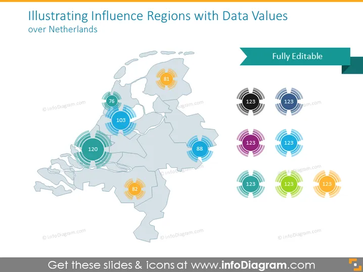
Die Folie zeigt eine Karte der Niederlande, begleitet von Datenwerten, die Einflussregionen repräsentieren. Jede Region ist mit einer kreisförmigen Grafik und einer Zahl darin hervorgehoben, die eine quantifizierbare Metrik vorschlägt. Dies könnte verschiedene regionale Daten wie Bevölkerung, Verkaufsvolumen oder eine andere messbare Statistik anzeigen. Das Vorhandensein mehrerer Farben für die kreisförmigen Grafiken deutet darauf hin, dass unterschiedliche Kategorien oder Arten von Daten auf dieser Folie dargestellt werden könnten.
Die Folie hat eine klare, professionelle Ästhetik mit einer Farbpalette, die angenehm für das Auge und nicht überwältigend ist. Das Design ist klar und nutzt sowohl Farben als auch numerische Daten, um Informationen effektiv zu präsentieren.


