
Your graphics add a nice touch to my presentations and I recently used them for one of my all-hands meetings. Your toolbox adds professionalism to my slides. Instead of using standard clipart.
Claude Jones, Director of Engineer, @Walmartlabs, USA
Your graphics add a nice touch to my presentations and I recently used them for one of my all-hands meetings. Your toolbox adds professionalism to my slides. Instead of using standard clipart.
Claude Jones, Director of Engineer, @Walmartlabs, USA
I needed a fresh look at some of my slides. I've tried to find a way to create a paintbrush effect, to underline, accentuate, add some color and the handwritten markers were just the things. Very easy to use, easy to size, change the color. It was an affordable, perfect solution and I'm happy to recommend it.
Anonymous, US
The crisp, clean look of the graphics, and the fact that it allowed me to easily edit and change the colors to match the template was my main reason for purchasing them.
Brandie Jenkins, E-learning Developer, USA
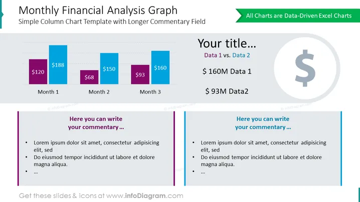
Die Folie mit dem Titel "Monatliche Finanzanalyse-Grafik" präsentiert eine einfache Säulendiagrammvorlage, die zum Anzeigen finanzieller Daten über drei Monate konzipiert ist. Sie verfügt über zwei Säulen für jeden Monat, wobei jede Säule die jeweiligen Geldwerte angibt und somit einen Vergleich zwischen zwei verschiedenen Datensätzen erleichtert. Die Textplatzhalter mit den Bezeichnungen "Ihr Titel...", "Daten 1 vs. Daten 2" und "Hier können Sie Ihren Kommentar schreiben..." zeigen an, wo Präsentatoren ihre eigenen Titel, Datenvergleiche und detaillierte Kommentare einfügen können, um die im Diagramm dargestellten Trends oder Werte zu erläutern.
Die Folie ist visuell ausgewogen, mit einem sauberen und professionellen Design. Die Verwendung von Farben hilft, Daten zu unterscheiden, und das Layout ist organisiert, um den Betrachter logisch durch die Folie zu führen.




