Your graphics add a nice touch to my presentations and I recently used them for one of my all-hands meetings. Your toolbox adds professionalism to my slides. Instead of using standard clipart.
Claude Jones, Director of Engineer, @Walmartlabs, USA
Your graphics add a nice touch to my presentations and I recently used them for one of my all-hands meetings. Your toolbox adds professionalism to my slides. Instead of using standard clipart.
Claude Jones, Director of Engineer, @Walmartlabs, USA
I needed a fresh look at some of my slides. I've tried to find a way to create a paintbrush effect, to underline, accentuate, add some color and the handwritten markers were just the things. Very easy to use, easy to size, change the color. It was an affordable, perfect solution and I'm happy to recommend it.
Anonymous, US
The crisp, clean look of the graphics, and the fact that it allowed me to easily edit and change the colors to match the template was my main reason for purchasing them.
Brandie Jenkins, E-learning Developer, USA
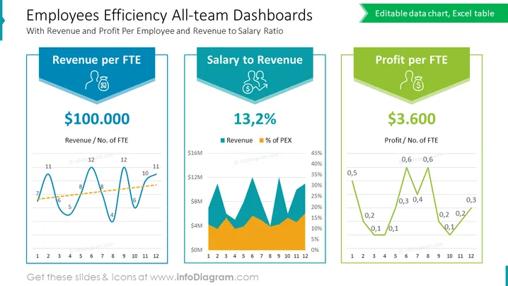
Dies ist eine farbenfrohe, aber einfache Zusammenfassung der Effizienzdaten von Mitarbeitern, die in Form von 3 verschiedenen Excel-gesteuerten Diagrammen dargestellt wird. Diskutieren Sie den Umsatz pro FTE, das Verhältnis von Gehalt zu Umsatz und den Gewinn pro FTE mit einem organisierten Dashboard, das entscheidende Daten mit Liniendiagrammen, Trendlinien und Flächendiagrammen hervorhebt.
Diese Vorlage für Team-Dashboards zur Effizienz der Mitarbeiter ist Teil unserer PPT-Vorlage für die Unternehmensstadtversammlung.


