

Your graphics add a nice touch to my presentations and I recently used them for one of my all-hands meetings. Your toolbox adds professionalism to my slides. Instead of using standard clipart.
Claude Jones, Director of Engineer, @Walmartlabs, USA

Your graphics add a nice touch to my presentations and I recently used them for one of my all-hands meetings. Your toolbox adds professionalism to my slides. Instead of using standard clipart.
Claude Jones, Director of Engineer, @Walmartlabs, USA
I needed a fresh look at some of my slides. I've tried to find a way to create a paintbrush effect, to underline, accentuate, add some color and the handwritten markers were just the things. Very easy to use, easy to size, change the color. It was an affordable, perfect solution and I'm happy to recommend it.
Anonymous, US
The crisp, clean look of the graphics, and the fact that it allowed me to easily edit and change the colors to match the template was my main reason for purchasing them.
Brandie Jenkins, E-learning Developer, USA
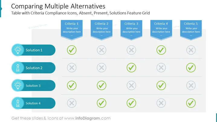
Die Folie mit dem Titel "Vergleich mehrerer Alternativen" scheint dafür gestaltet zu sein, verschiedene Lösungen anhand einer Reihe von Kriterien zu bewerten. Jedes Kriterium wird durch einen 3D-blauen Chevron dargestellt, der Platz für eine Beschreibung bietet. Vier Lösungen sind vertikal links aufgeführt, jede mit einem entsprechenden grafischen Icon und einem Häkchen (✓) oder einem Kreuz (X) Symbol horizontal daneben, um anzuzeigen, ob die Lösung jedes Kriterium erfüllt.
Die Folie hat ein sauberes, professionelles Aussehen mit einem Farbschema aus Blau, Grün und Grau, das ein visuell harmonisches Layout schafft. Die Verwendung von Icons und Häkchen/Kreuzen bietet eine leicht verständliche visuelle Darstellung des Vergleichs.



