Your graphics add a nice touch to my presentations and I recently used them for one of my all-hands meetings. Your toolbox adds professionalism to my slides. Instead of using standard clipart.
Claude Jones, Director of Engineer, @Walmartlabs, USA
Your graphics add a nice touch to my presentations and I recently used them for one of my all-hands meetings. Your toolbox adds professionalism to my slides. Instead of using standard clipart.
Claude Jones, Director of Engineer, @Walmartlabs, USA
I needed a fresh look at some of my slides. I've tried to find a way to create a paintbrush effect, to underline, accentuate, add some color and the handwritten markers were just the things. Very easy to use, easy to size, change the color. It was an affordable, perfect solution and I'm happy to recommend it.
Anonymous, US
The crisp, clean look of the graphics, and the fact that it allowed me to easily edit and change the colors to match the template was my main reason for purchasing them.
Brandie Jenkins, E-learning Developer, USA
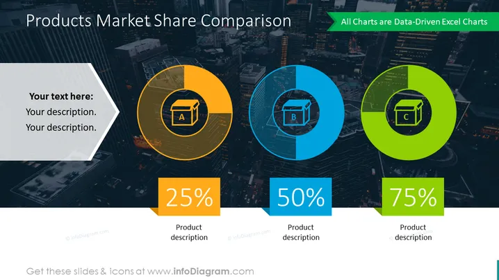
Die Folie ist so gestaltet, dass sie einen Vergleich des Marktanteils von drei Produkten präsentiert, die mit A, B und C gekennzeichnet sind. Jedes Produkt hat einen eigenen Kreis, der bis zu einem bestimmten Prozentsatz gefüllt ist, der seinen Marktanteil darstellt - 25 % für Produkt A, 50 % für Produkt B und 75 % für Produkt C. Diese Kreise sind keine vollständigen Tortendiagramme, sondern sehen aus wie Teile von Kreisen, die eingefärbt sind, um den Prozentsatz des Marktanteils zu kennzeichnen. Neben jeder grafischen Darstellung gibt es Platz für eine textuelle Produktbeschreibung, die dem Publikum hilft, zu verstehen, was jedes Produkt umfasst.
Die Folie ist modern und visuell auffällig, mit kräftigen Farbkontrasten, die die Informationen hervorheben. Die Symbole und die Farbgebung sind einfach, aber effektiv, um die Informationen in einem schnellen, leicht verständlichen Format zu vermitteln.


