
Your graphics add a nice touch to my presentations and I recently used them for one of my all-hands meetings. Your toolbox adds professionalism to my slides. Instead of using standard clipart.
Claude Jones, Director of Engineer, @Walmartlabs, USA
Your graphics add a nice touch to my presentations and I recently used them for one of my all-hands meetings. Your toolbox adds professionalism to my slides. Instead of using standard clipart.
Claude Jones, Director of Engineer, @Walmartlabs, USA
I needed a fresh look at some of my slides. I've tried to find a way to create a paintbrush effect, to underline, accentuate, add some color and the handwritten markers were just the things. Very easy to use, easy to size, change the color. It was an affordable, perfect solution and I'm happy to recommend it.
Anonymous, US
The crisp, clean look of the graphics, and the fact that it allowed me to easily edit and change the colors to match the template was my main reason for purchasing them.
Brandie Jenkins, E-learning Developer, USA
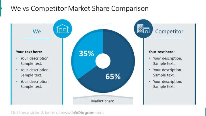
Die Folie ist so gestaltet, dass sie den Marktanteil zwischen "Wir" und einem "Wettbewerber" anhand eines Kreisdiagramms und Textbeschreibungen vergleicht. Das Kreisdiagramm zeigt deutlich zwei Segmente, eines, das 35% des Marktanteils repräsentiert, und das andere, das 65% einnimmt. Neben jedem Titel – „Wir“ und „Wettbewerber“ – gibt es Platz für Beschreibungen, die die Möglichkeit bieten, die Stärken oder die Marktposition jeder Einheit zu erläutern. Jeder Abschnitt hat drei Aufzählungspunkte, um benutzerdefinierten Text hinzuzufügen, der die Gründe oder Faktoren hinter der Verteilung des Marktanteils beschreibt.
Der Gesamteindruck der Folie ist professionell und klar, mit einem symmetrischen Design, das zwei Einheiten direkt gegenüberstellt. Die Verwendung von Blautönen und einfachen Symbolen verleiht ihr ein Unternehmensgefühl, das die Lesbarkeit und den Fokus auf die zentralen Daten verbessert.




