Your graphics add a nice touch to my presentations and I recently used them for one of my all-hands meetings. Your toolbox adds professionalism to my slides. Instead of using standard clipart.
Claude Jones, Director of Engineer, @Walmartlabs, USA
Your graphics add a nice touch to my presentations and I recently used them for one of my all-hands meetings. Your toolbox adds professionalism to my slides. Instead of using standard clipart.
Claude Jones, Director of Engineer, @Walmartlabs, USA
I needed a fresh look at some of my slides. I've tried to find a way to create a paintbrush effect, to underline, accentuate, add some color and the handwritten markers were just the things. Very easy to use, easy to size, change the color. It was an affordable, perfect solution and I'm happy to recommend it.
Anonymous, US
The crisp, clean look of the graphics, and the fact that it allowed me to easily edit and change the colors to match the template was my main reason for purchasing them.
Brandie Jenkins, E-learning Developer, USA
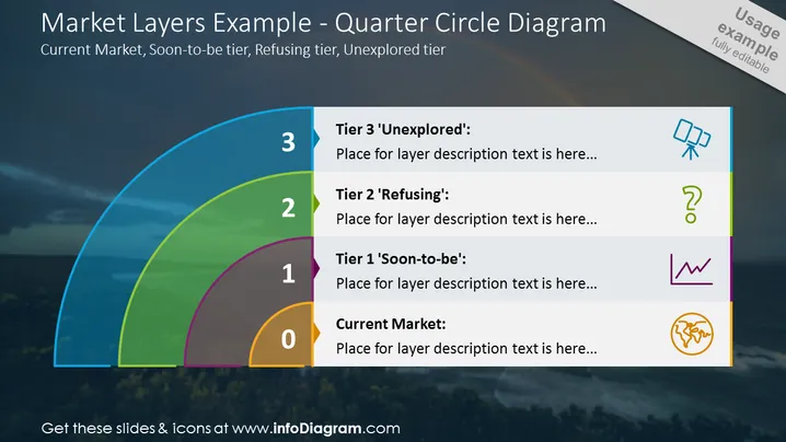
Die PowerPoint-Folie mit dem Titel "Marktanteile Beispiel - Viertelkreisdiagramm" erklärt die Schichtung der Markt Kategorien mit den Ebenen 0 bis 3: "Aktueller Markt", "Stufe 1 'Bald-die'", "Stufe 2 'Ablehnend'" und "Stufe 3 'Unerschlossen'". Jede Ebene verfügt über einen Platzhalter für eine Beschreibung, die angibt, wo eine detaillierte Erklärung hinzugefügt werden kann. Die numerische Kennzeichnung und die Ebenennamen deuten auf einen Fortschritt vom etablierten Markt zu unerforschten Segmenten hin, wobei jede Ebene einen spezifischen Stadium in der Marktentwicklung oder Kundensegmentierung darstellt.
Das Gesamterscheinungsbild der Folie ist elegant und professionell, mit einer Mischung visueller Elemente, die das Verständnis verbessern. Die hellen Farben, die für jede Markt Schicht verwendet werden, schaffen eine klare Unterscheidung und Hierarchie, die den Betrachter visuell und kognitiv ansprechen.


