Your graphics add a nice touch to my presentations and I recently used them for one of my all-hands meetings. Your toolbox adds professionalism to my slides. Instead of using standard clipart.
Claude Jones, Director of Engineer, @Walmartlabs, USA
Your graphics add a nice touch to my presentations and I recently used them for one of my all-hands meetings. Your toolbox adds professionalism to my slides. Instead of using standard clipart.
Claude Jones, Director of Engineer, @Walmartlabs, USA
I needed a fresh look at some of my slides. I've tried to find a way to create a paintbrush effect, to underline, accentuate, add some color and the handwritten markers were just the things. Very easy to use, easy to size, change the color. It was an affordable, perfect solution and I'm happy to recommend it.
Anonymous, US
The crisp, clean look of the graphics, and the fact that it allowed me to easily edit and change the colors to match the template was my main reason for purchasing them.
Brandie Jenkins, E-learning Developer, USA
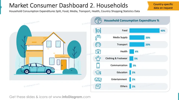
Die Folie zeigt die prozentualen Ausgaben für den Verbrauch von Haushalten in verschiedenen Kategorien. Lebensmittel machen 40% der Ausgaben aus, was den größten Anteil für Ernährung und Lebensmittel beschreibt. Medienversorgung und Transport nehmen jeweils 20% ein und spiegeln wesentliche Kommunikations- und Mobilitätsbedürfnisse wider. Gesundheitsausgaben liegen bei 6% und decken medizinische Kosten ab. Bekleidung und Schuhe summieren sich auf 5% und heben Käufe von Kleidung und Schuhwerk hervor. Kommunikation (3%), Bildung (2%), Unterhaltung (2%) und andere (2%) stellen kleinere Ausgabenbereiche dar, die zusätzliche Ausgaben betonen.


