Your graphics add a nice touch to my presentations and I recently used them for one of my all-hands meetings. Your toolbox adds professionalism to my slides. Instead of using standard clipart.
Claude Jones, Director of Engineer, @Walmartlabs, USA
Your graphics add a nice touch to my presentations and I recently used them for one of my all-hands meetings. Your toolbox adds professionalism to my slides. Instead of using standard clipart.
Claude Jones, Director of Engineer, @Walmartlabs, USA
I needed a fresh look at some of my slides. I've tried to find a way to create a paintbrush effect, to underline, accentuate, add some color and the handwritten markers were just the things. Very easy to use, easy to size, change the color. It was an affordable, perfect solution and I'm happy to recommend it.
Anonymous, US
The crisp, clean look of the graphics, and the fact that it allowed me to easily edit and change the colors to match the template was my main reason for purchasing them.
Brandie Jenkins, E-learning Developer, USA
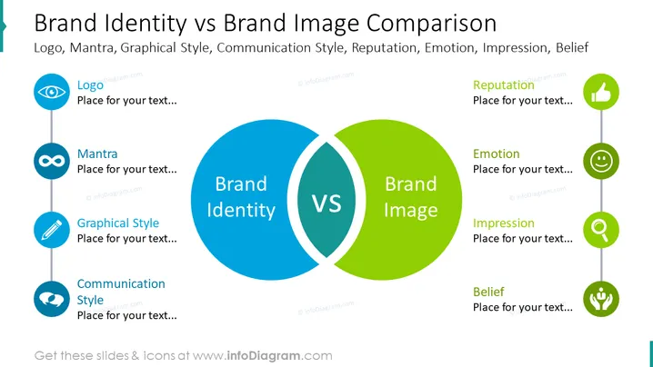
##Folieninhalt Dies ist die Vergleichsfolie zur Markenidentität und zum Markenimage. Die Komponenten der Markenidentität sind das Logo des Unternehmens, das Mantra, der grafische Stil und der Kommunikationsstil. Auf der anderen Seite sind die Komponenten des Markenimages der Ruf des Unternehmens, Emotionen, der Eindruck, den es auf Kunden hinterlässt, und Überzeugungen. Sie können diese PowerPoint-Folie verwenden, wenn Sie ein Marketingmanager sind, der den Unterschied zwischen Markenidentität und Markenimage erklären möchte. Sie können diese PPT-Vorlage auf Google Slides und Keynote herunterladen. ##Foliendatenbeschreibung: Weißer Hintergrund, Textfeld, Augen-Icon, Logo-Icon, Unendlichkeit-Icon, Mantra-Icon, Bleistift-Icon, Dialog-Icon, Daumen-hoch-Icon, Ruf-Icon, lächelndes Gesicht-Icon, Emotionen-Icon, Lupe-Icon, Überzeugungs-Icon


