
Your graphics add a nice touch to my presentations and I recently used them for one of my all-hands meetings. Your toolbox adds professionalism to my slides. Instead of using standard clipart.
Claude Jones, Director of Engineer, @Walmartlabs, USA
Your graphics add a nice touch to my presentations and I recently used them for one of my all-hands meetings. Your toolbox adds professionalism to my slides. Instead of using standard clipart.
Claude Jones, Director of Engineer, @Walmartlabs, USA
I needed a fresh look at some of my slides. I've tried to find a way to create a paintbrush effect, to underline, accentuate, add some color and the handwritten markers were just the things. Very easy to use, easy to size, change the color. It was an affordable, perfect solution and I'm happy to recommend it.
Anonymous, US
The crisp, clean look of the graphics, and the fact that it allowed me to easily edit and change the colors to match the template was my main reason for purchasing them.
Brandie Jenkins, E-learning Developer, USA
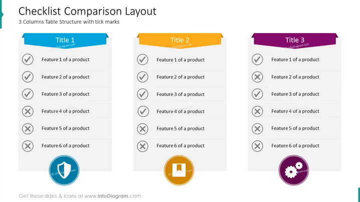
Die Folie mit dem Titel "Vergleichs-Layout der Checkliste" zeigt eine Tabelle mit drei Spalten, wobei jede Spalte einen Produktvergleich darstellt. Jede Spalte hat ein deutlich farblich gekennzeichnetes Titelfeld (Titel 1, Titel 2, Titel 3). Unter den Titeln gibt es Listen von Merkmalen, die mit Häkchen (✓) für vorhandene Merkmale und mit Kreuzen (✕) für nicht vorhandene Merkmale gekennzeichnet sind, die von 'Merkmal 1 eines Produkts' bis 'Merkmal 6 eines Produkts' reichen. Das Vorhandensein oder Fehlen eines Merkmals bietet einen klaren visuellen Vergleich zwischen den Produkten.
Das Gesamtdesign der Folie ist modern und einfach, verwendet Farbcode und einfache Symbole, um die Merkmale von drei Produkten effektiv zu vergleichen. Die Verwendung von Haken- und Kreuzsymbolen zusammen mit farbigen Bannern vermittelt dem Publikum sofort ein Gefühl des Vergleichs.




