Your graphics add a nice touch to my presentations and I recently used them for one of my all-hands meetings. Your toolbox adds professionalism to my slides. Instead of using standard clipart.
Claude Jones, Director of Engineer, @Walmartlabs, USA
Your graphics add a nice touch to my presentations and I recently used them for one of my all-hands meetings. Your toolbox adds professionalism to my slides. Instead of using standard clipart.
Claude Jones, Director of Engineer, @Walmartlabs, USA
I needed a fresh look at some of my slides. I've tried to find a way to create a paintbrush effect, to underline, accentuate, add some color and the handwritten markers were just the things. Very easy to use, easy to size, change the color. It was an affordable, perfect solution and I'm happy to recommend it.
Anonymous, US
The crisp, clean look of the graphics, and the fact that it allowed me to easily edit and change the colors to match the template was my main reason for purchasing them.
Brandie Jenkins, E-learning Developer, USA
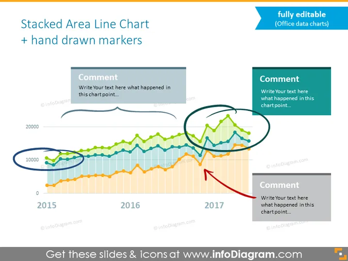
Ansprechendes gestapeltes Flächen-Liniendiagramm, das es Ihnen ermöglicht, mehrere Ergebnisse in einem Diagramm darzustellen. Diskutieren Sie über die Ergebnisse der folgenden Jahre mit diesem datengetriebenen Excel-Diagramm, geräumigen Textcontainern für Kommentare und einzigartigen handgezeichneten Kritzel-Formen zur Hervorhebung der wesentlichen Daten.
Diese Vorlage für ein Liniendiagramm mit Markierungen, Kommentaren und Platz für die Beschreibung ist Teil unserer Flat Data-Driven Presentation Charts PPT Vorlage.


