Your graphics add a nice touch to my presentations and I recently used them for one of my all-hands meetings. Your toolbox adds professionalism to my slides. Instead of using standard clipart.
Claude Jones, Director of Engineer, @Walmartlabs, USA
Your graphics add a nice touch to my presentations and I recently used them for one of my all-hands meetings. Your toolbox adds professionalism to my slides. Instead of using standard clipart.
Claude Jones, Director of Engineer, @Walmartlabs, USA
I needed a fresh look at some of my slides. I've tried to find a way to create a paintbrush effect, to underline, accentuate, add some color and the handwritten markers were just the things. Very easy to use, easy to size, change the color. It was an affordable, perfect solution and I'm happy to recommend it.
Anonymous, US
The crisp, clean look of the graphics, and the fact that it allowed me to easily edit and change the colors to match the template was my main reason for purchasing them.
Brandie Jenkins, E-learning Developer, USA
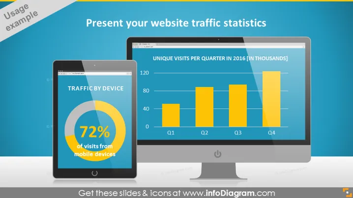
Die Folie ist so gestaltet, dass sie die Website-Verkehrsstatistiken präsentiert, wobei der Fokus auf der Geräteverwendung und den einzigartigen Besuchen pro Quartal liegt. Der Abschnitt "VERKEHR NACH GERÄT" hebt hervor, dass 72 % der Besuche von mobilen Geräten stammen, was die Bedeutung der mobilen Optimierung für die Website anzeigt. Das Balkendiagramm mit dem Titel "EINZIGE BESUCHE PRO QUARTAL IM JAHR 2016 [IN TAUSEND]" zeigt eine quartalsweise Verteilung und deutet auf eine Trendanalyse oder Leistungsübersicht des Website-Verkehrs in diesem Jahr hin.
Die Folie verwendet eine Kombination aus Icons, Farben und Formen, um eine visuell ansprechende Präsentation der Daten zu erstellen. Die kontrastierenden Blautöne und realistischen Gerätemockups verleihen ein professionelles und modernes Gefühl.


