Your graphics add a nice touch to my presentations and I recently used them for one of my all-hands meetings. Your toolbox adds professionalism to my slides. Instead of using standard clipart.
Claude Jones, Director of Engineer, @Walmartlabs, USA
Your graphics add a nice touch to my presentations and I recently used them for one of my all-hands meetings. Your toolbox adds professionalism to my slides. Instead of using standard clipart.
Claude Jones, Director of Engineer, @Walmartlabs, USA
I needed a fresh look at some of my slides. I've tried to find a way to create a paintbrush effect, to underline, accentuate, add some color and the handwritten markers were just the things. Very easy to use, easy to size, change the color. It was an affordable, perfect solution and I'm happy to recommend it.
Anonymous, US
The crisp, clean look of the graphics, and the fact that it allowed me to easily edit and change the colors to match the template was my main reason for purchasing them.
Brandie Jenkins, E-learning Developer, USA
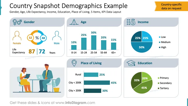
Die Folie veranschaulicht die Visualisierung demografischer Daten, einschließlich der Geschlechterverteilung - 52% weiblich und 48% männlich - mit einer Lebenserwartung von 87 bzw. 72 Jahren. Die Altersstatistik wird detailliert mit Balkendiagrammen dargestellt: 10% im Alter von 0-14 Jahren, 25% im Alter von 15-24 Jahren und 30% im Alter von 25-54 Jahren. Die Einkommensgruppen teilen sich in 25% niedrig, 25% mittel und 50% hoch ein, visualisiert in einem Kreisdiagramm. Der Wohnort umfasst 25% ländlich, 45% in Städten unter 200.000 und 30% in größeren Städten. Die Bildungsniveaus zeigen 35% Grundschule, 45% Sekundarschule und 20% Hochschule, ebenfalls in einem Kreisdiagramm dargestellt.


