Your graphics add a nice touch to my presentations and I recently used them for one of my all-hands meetings. Your toolbox adds professionalism to my slides. Instead of using standard clipart.
Claude Jones, Director of Engineer, @Walmartlabs, USA
Your graphics add a nice touch to my presentations and I recently used them for one of my all-hands meetings. Your toolbox adds professionalism to my slides. Instead of using standard clipart.
Claude Jones, Director of Engineer, @Walmartlabs, USA
I needed a fresh look at some of my slides. I've tried to find a way to create a paintbrush effect, to underline, accentuate, add some color and the handwritten markers were just the things. Very easy to use, easy to size, change the color. It was an affordable, perfect solution and I'm happy to recommend it.
Anonymous, US
The crisp, clean look of the graphics, and the fact that it allowed me to easily edit and change the colors to match the template was my main reason for purchasing them.
Brandie Jenkins, E-learning Developer, USA
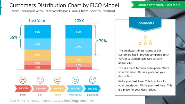
Die Folie vergleicht die Verteilung der Kreditwürdigkeit von Kunden zwischen dem vergangenen Jahr und dem aktuellen Jahr mithilfe eines vertikalen gestapelten Balkendiagramms, wobei jeder Abschnitt farblich nach FICO-Score-Bereich kodiert ist. "Letztes Jahr" zeigt eine negative Veränderung von 55 % in der Kundenverteilung, wobei die Mehrheit im Bereich "Schlecht" bis "Befriedigend" bewertet wurde. Im Gegensatz dazu zeigt "20XX" eine positive Verschiebung von 70 % hin zu den Kategorien "Sehr Gut" und "Ausgezeichnet", was auf eine Verbesserung der Kreditbewertungen der Kunden hinweist.
Die Folie besitzt ein zeitgemäßes Design.


