Your graphics add a nice touch to my presentations and I recently used them for one of my all-hands meetings. Your toolbox adds professionalism to my slides. Instead of using standard clipart.
Claude Jones, Director of Engineer, @Walmartlabs, USA
Your graphics add a nice touch to my presentations and I recently used them for one of my all-hands meetings. Your toolbox adds professionalism to my slides. Instead of using standard clipart.
Claude Jones, Director of Engineer, @Walmartlabs, USA
I needed a fresh look at some of my slides. I've tried to find a way to create a paintbrush effect, to underline, accentuate, add some color and the handwritten markers were just the things. Very easy to use, easy to size, change the color. It was an affordable, perfect solution and I'm happy to recommend it.
Anonymous, US
The crisp, clean look of the graphics, and the fact that it allowed me to easily edit and change the colors to match the template was my main reason for purchasing them.
Brandie Jenkins, E-learning Developer, USA
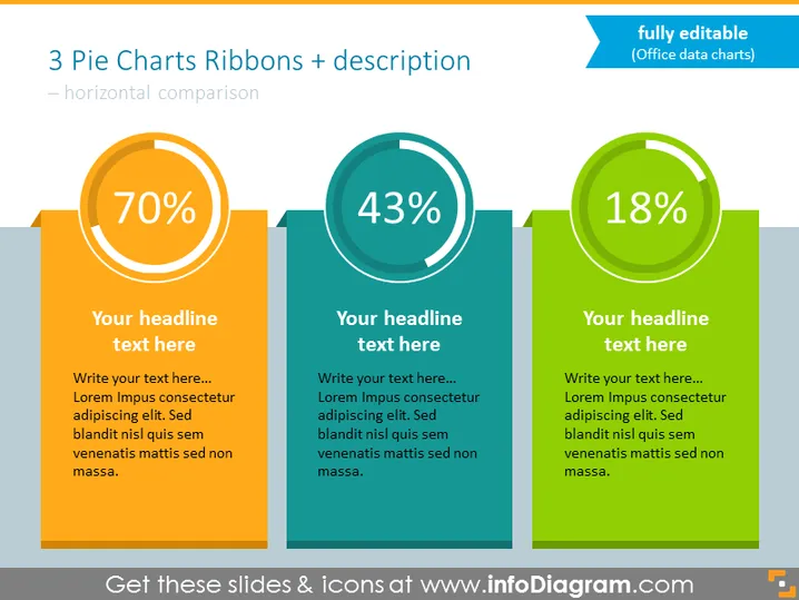
Die Folie präsentiert einen Vergleich zwischen drei verschiedenen Datenpunkten mithilfe von Kuchendiagrammen, die jeweils eine entsprechende Bänderform und beschreibenden Text aufweisen. Das erste Kuchendiagramm zeigt einen Datenpunkt von 70%, was auf einen signifikanten Anteil eines Objekts oder einer Kennzahl hindeutet. Das zweite Diagramm zeigt eine Zahl von 43%, was auf ein kleineres Segment im Verhältnis zum ersten hindeutet. Das dritte Diagramm hat einen Datenpunkt von 18%, der den kleinsten Anteil unter den verglichenen Elementen hervorhebt. Unter jedem Kuchendiagramm befindet sich ein Platzhalter für eine Überschrift und zusätzlichen Text für eine detailliertere Erklärung.


