Your graphics add a nice touch to my presentations and I recently used them for one of my all-hands meetings. Your toolbox adds professionalism to my slides. Instead of using standard clipart.
Claude Jones, Director of Engineer, @Walmartlabs, USA
Your graphics add a nice touch to my presentations and I recently used them for one of my all-hands meetings. Your toolbox adds professionalism to my slides. Instead of using standard clipart.
Claude Jones, Director of Engineer, @Walmartlabs, USA
I needed a fresh look at some of my slides. I've tried to find a way to create a paintbrush effect, to underline, accentuate, add some color and the handwritten markers were just the things. Very easy to use, easy to size, change the color. It was an affordable, perfect solution and I'm happy to recommend it.
Anonymous, US
The crisp, clean look of the graphics, and the fact that it allowed me to easily edit and change the colors to match the template was my main reason for purchasing them.
Brandie Jenkins, E-learning Developer, USA
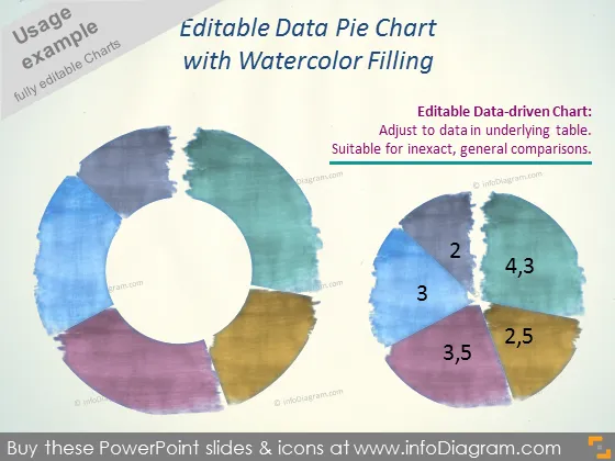
Die Folie präsentiert ein "Bearbeitbares Daten-Kreisdiagramm mit Aquarellfüllung", das auf grafische Darstellungen abzielt, die für ungenaue, allgemeine Vergleiche geeignet sind. Dieses Kreisdiagramm ist datenbasiert, passt sich an die Daten in der zugrunde liegenden Tabelle an, was eine flexible Präsentation von Statistiken oder verschiedenen Segmenten ermöglicht. Das Diagramm enthält Segmente, die mit Zahlen wie "2", "3", "4,3", "2,5", "3,5" beschriftet sind, die jeweils vermutlich den Datenwerten einer bearbeitbaren Quelle entsprechen.
Der texturierte Aquarelleffekt des Kreisdiagramms lässt es von typischen Flachdesign-Diagrammen hervorstechen und bietet ein einzigartiges und visuell ansprechendes Präsentationselement. Das minimalistische Design sorgt dafür, dass der Fokus auf dem bunten Diagramm selbst bleibt.


