Your graphics add a nice touch to my presentations and I recently used them for one of my all-hands meetings. Your toolbox adds professionalism to my slides. Instead of using standard clipart.
Claude Jones, Director of Engineer, @Walmartlabs, USA
Your graphics add a nice touch to my presentations and I recently used them for one of my all-hands meetings. Your toolbox adds professionalism to my slides. Instead of using standard clipart.
Claude Jones, Director of Engineer, @Walmartlabs, USA
I needed a fresh look at some of my slides. I've tried to find a way to create a paintbrush effect, to underline, accentuate, add some color and the handwritten markers were just the things. Very easy to use, easy to size, change the color. It was an affordable, perfect solution and I'm happy to recommend it.
Anonymous, US
The crisp, clean look of the graphics, and the fact that it allowed me to easily edit and change the colors to match the template was my main reason for purchasing them.
Brandie Jenkins, E-learning Developer, USA
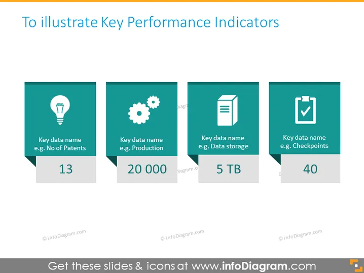
Die Folie ist so gestaltet, dass sie verschiedene Schlüsselkennzahlen (KPIs) präsentiert. Jede KPI wird durch ein Quadrat mit einem spezifischen Symbol und einem farbigen Hintergrund dargestellt. Der Titel legt nahe, dass dies Beispiele für Metriken sind, um die Leistung zu verfolgen, wie "Anzahl der Patente", "Produktion", "Datenspeicher" und "Meilensteine", die jeweils mit Innovation, Fertigungsprozessen, IT-Ressourcen und Projektmeilensteinen verbunden werden können. Diese KPIs sind mit Werten wie "13", "20.000", "5 TB" und "40" quantifiziert, was die Messung jedes Indikators anzeigt.
Die Folie weist ein sauberes, modernes Design mit einem einheitlichen Farbschema und einfachen Grafiken auf, um die Datenpunkte klar zu vermitteln. Die Symbole werden effektiv eingesetzt, um verschiedene Bereiche der Leistungsbewertung darzustellen.


