

Your graphics add a nice touch to my presentations and I recently used them for one of my all-hands meetings. Your toolbox adds professionalism to my slides. Instead of using standard clipart.
Claude Jones, Director of Engineer, @Walmartlabs, USA

Your graphics add a nice touch to my presentations and I recently used them for one of my all-hands meetings. Your toolbox adds professionalism to my slides. Instead of using standard clipart.
Claude Jones, Director of Engineer, @Walmartlabs, USA
I needed a fresh look at some of my slides. I've tried to find a way to create a paintbrush effect, to underline, accentuate, add some color and the handwritten markers were just the things. Very easy to use, easy to size, change the color. It was an affordable, perfect solution and I'm happy to recommend it.
Anonymous, US
The crisp, clean look of the graphics, and the fact that it allowed me to easily edit and change the colors to match the template was my main reason for purchasing them.
Brandie Jenkins, E-learning Developer, USA
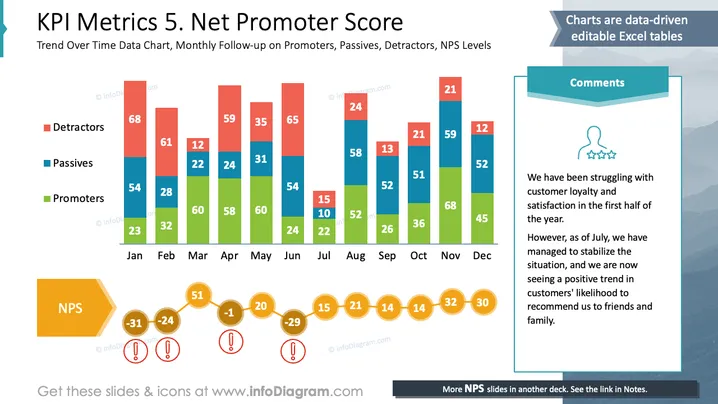
Diese Folie zeigt eine Analyse des Net Promoter Score (NPS) über ein Jahr. Sie zeigt monatliche Trends für drei Kundengruppen: Detraktoren kritisieren den Service, was den NPS negativ beeinflusst. Passive sind indifferent und haben wenig Einfluss auf den NPS. Promotoren empfehlen den Service und steigern den NPS. Kommentare weisen auf eine anfänglich niedrige Kundenzufriedenheit hin, die sich ab Juli verbessert, wie durch die erhöhten Promotoren und den Rückgang der Detraktoren gezeigt wird.
Insgesamt kombiniert die Folie effektiv Datenvisualisierung mit narrativen Elementen. Die Diagrammfarben kontrastieren gut, wodurch verschiedene Datenkategorien leicht unterscheidbar sind.



