

Your graphics add a nice touch to my presentations and I recently used them for one of my all-hands meetings. Your toolbox adds professionalism to my slides. Instead of using standard clipart.
Claude Jones, Director of Engineer, @Walmartlabs, USA

Your graphics add a nice touch to my presentations and I recently used them for one of my all-hands meetings. Your toolbox adds professionalism to my slides. Instead of using standard clipart.
Claude Jones, Director of Engineer, @Walmartlabs, USA
I needed a fresh look at some of my slides. I've tried to find a way to create a paintbrush effect, to underline, accentuate, add some color and the handwritten markers were just the things. Very easy to use, easy to size, change the color. It was an affordable, perfect solution and I'm happy to recommend it.
Anonymous, US
The crisp, clean look of the graphics, and the fact that it allowed me to easily edit and change the colors to match the template was my main reason for purchasing them.
Brandie Jenkins, E-learning Developer, USA
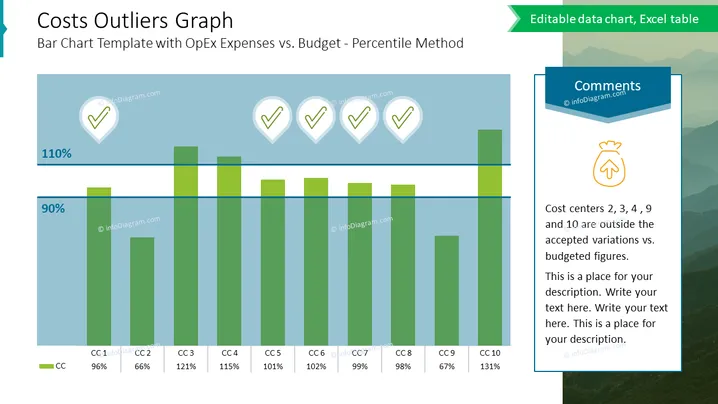
Diese Folie trägt den Titel "Kosten-Outlier-Diagramm" und beschäftigt sich mit einem Balkendiagramm zum Vergleich der Betriebskosten (OpEx) mit dem Budget unter Verwendung der Perzentil-Methode. Es wird das Konzept erläutert, wie verschiedene Kostenstellen (bezeichnet als CC1 bis CC10) im Vergleich zum Budget abschneiden, wobei hervorgehoben wird, welche außerhalb der akzeptierten Variation liegen. Jeder Balken der Kostenstelle wird mit einem Prozentwert ergänzt, um die Leistung gegenüber dem Budget anzuzeigen. Zum Beispiel liegt CC2 bei 66 %, was impliziert, dass es unter dem festgelegten Budget liegt, während CC4 bei 115 % auf eine Überschreitung des Budgets hinweist.
Die Folie ist sauber und professionell, mit einer kühlen Farbpalette, die hauptsächlich aus Blau- und Grüntönen besteht. Das Design konzentriert sich darauf, Daten klar durch visuelle Elemente wie das Balkendiagramm und Ikonographie zu präsentieren.



