Your graphics add a nice touch to my presentations and I recently used them for one of my all-hands meetings. Your toolbox adds professionalism to my slides. Instead of using standard clipart.
Claude Jones, Director of Engineer, @Walmartlabs, USA
Your graphics add a nice touch to my presentations and I recently used them for one of my all-hands meetings. Your toolbox adds professionalism to my slides. Instead of using standard clipart.
Claude Jones, Director of Engineer, @Walmartlabs, USA
I needed a fresh look at some of my slides. I've tried to find a way to create a paintbrush effect, to underline, accentuate, add some color and the handwritten markers were just the things. Very easy to use, easy to size, change the color. It was an affordable, perfect solution and I'm happy to recommend it.
Anonymous, US
The crisp, clean look of the graphics, and the fact that it allowed me to easily edit and change the colors to match the template was my main reason for purchasing them.
Brandie Jenkins, E-learning Developer, USA
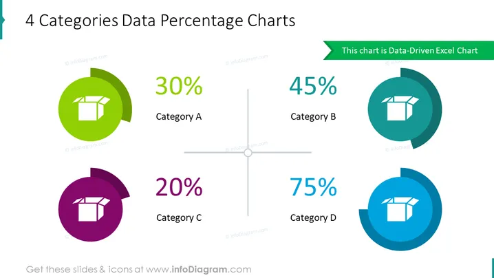
Diese PowerPoint-Folie stellt prozentuale Werte für vier unterschiedliche Kategorien – A, B, C und D – mit variierenden Anteilen dar. Kategorie A ist mit 30% verbunden, was auf einen moderaten, aber signifikanten Anteil hindeutet. Kategorie B mit 45% deutet darauf hin, dass sie einen größeren Anteil hält. Kategorie C hat den kleinsten Anteil von 20%, was einen geringeren Bereich oder einen Bereich mit geringerem Fokus widerspiegeln kann. Schließlich dominiert Kategorie D mit einem Anteil von 75% und hebt sie als die bedeutendste oder priorisierte Kategorie hervor.
Das Gesamterscheinungsbild der Folie ist modern und visuell ansprechend, mit einem guten Einsatz von Farben zur Unterscheidung der Kategorien. Die Verwendung von Donut-Diagrammen mit zentrierten Icons bietet eine einfache, aber effektive Möglichkeit, Datenanteile zu visualisieren.


