

Your graphics add a nice touch to my presentations and I recently used them for one of my all-hands meetings. Your toolbox adds professionalism to my slides. Instead of using standard clipart.
Claude Jones, Director of Engineer, @Walmartlabs, USA

Your graphics add a nice touch to my presentations and I recently used them for one of my all-hands meetings. Your toolbox adds professionalism to my slides. Instead of using standard clipart.
Claude Jones, Director of Engineer, @Walmartlabs, USA
I needed a fresh look at some of my slides. I've tried to find a way to create a paintbrush effect, to underline, accentuate, add some color and the handwritten markers were just the things. Very easy to use, easy to size, change the color. It was an affordable, perfect solution and I'm happy to recommend it.
Anonymous, US
The crisp, clean look of the graphics, and the fact that it allowed me to easily edit and change the colors to match the template was my main reason for purchasing them.
Brandie Jenkins, E-learning Developer, USA
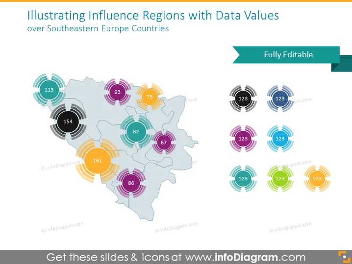
Die PowerPoint-Folie präsentiert eine datengetriebene Analyse von Einflussregionen in Südosteuropa. Sie visualisiert verschiedene Zahlenwerte, die bestimmten Regionen zugeordnet sind und wahrscheinlich quantitative Maße wie Wirtschaftsdaten, Bevölkerung oder andere regional relevante Statistiken anzeigen. Jede Zahl ist in bunten konzentrischen Kreisen eingeschlossen, möglicherweise um den Einfluss oder die Intensität der Auswirkungen im Zusammenhang mit der jeweiligen Zahl darzustellen. Eine Karte dient als Hintergrund für die Datenpunkte und sorgt dafür, dass der geografische Kontext gewahrt bleibt. Diese Form der Präsentation ist entscheidend für die Analyse räumlicher Daten.
Die Folie hat ein sauberes und modernes Design mit einer Mischung aus grafischen Elementen und Text, um Daten in einem leicht verdaulichen Format zu präsentieren. Die farbkodierten, mehrringigen Diagramme fügen eine visuelle Hierarchie zu den Zahlenwerten hinzu und machen Vergleiche intuitiv.



