

Your graphics add a nice touch to my presentations and I recently used them for one of my all-hands meetings. Your toolbox adds professionalism to my slides. Instead of using standard clipart.
Claude Jones, Director of Engineer, @Walmartlabs, USA

Your graphics add a nice touch to my presentations and I recently used them for one of my all-hands meetings. Your toolbox adds professionalism to my slides. Instead of using standard clipart.
Claude Jones, Director of Engineer, @Walmartlabs, USA
I needed a fresh look at some of my slides. I've tried to find a way to create a paintbrush effect, to underline, accentuate, add some color and the handwritten markers were just the things. Very easy to use, easy to size, change the color. It was an affordable, perfect solution and I'm happy to recommend it.
Anonymous, US
The crisp, clean look of the graphics, and the fact that it allowed me to easily edit and change the colors to match the template was my main reason for purchasing them.
Brandie Jenkins, E-learning Developer, USA
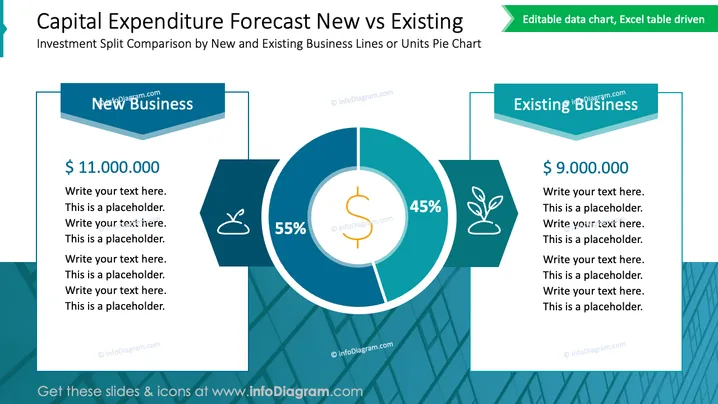
Die Folie zeigt einen Vergleich der Investitionsausgaben zwischen neuen und bestehenden Geschäftsbereichen oder Einheiten, wobei ein Kreisdiagramm zur Darstellung der Aufteilung verwendet wird. Die linke Seite der Folie zeigt die Anlagedetails für "Neugeschäft" mit einem angegebenen Betrag von 11.000.000 US-Dollar, was eine wesentlich größere Zuteilung für neue Unternehmungen suggeriert. Die rechte Seite hebt "Bestandsgeschäft" mit einer Zuteilung von 9.000.000 US-Dollar hervor, was einen etwas kleineren Anteil für laufende Geschäfte anzeigt. Das Kreisdiagramm in der Mitte zeigt zwei Abschnitte, 55 % und 45 %, um die Verteilung der Investitionen zwischen neuen und bestehenden Geschäften visuell darzustellen.
Die Folie ist gut organisiert und verwendet Symbole und kontrastierende Farben, um die Aufteilung der Kapitalinvestitionen effektiv zu vermitteln. Das Gesamtdesign ist klar und lenkt die Aufmerksamkeit auf die Vergleichsdaten zwischen neuen und bestehenden Geschäftsvorhaben.



