

Your graphics add a nice touch to my presentations and I recently used them for one of my all-hands meetings. Your toolbox adds professionalism to my slides. Instead of using standard clipart.
Claude Jones, Director of Engineer, @Walmartlabs, USA

Your graphics add a nice touch to my presentations and I recently used them for one of my all-hands meetings. Your toolbox adds professionalism to my slides. Instead of using standard clipart.
Claude Jones, Director of Engineer, @Walmartlabs, USA
I needed a fresh look at some of my slides. I've tried to find a way to create a paintbrush effect, to underline, accentuate, add some color and the handwritten markers were just the things. Very easy to use, easy to size, change the color. It was an affordable, perfect solution and I'm happy to recommend it.
Anonymous, US
The crisp, clean look of the graphics, and the fact that it allowed me to easily edit and change the colors to match the template was my main reason for purchasing them.
Brandie Jenkins, E-learning Developer, USA
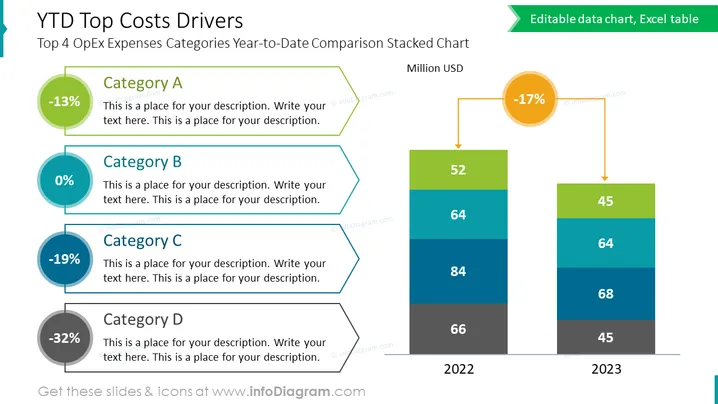
Die Folie trägt den Titel "YTD Top Kosten Treiber" und den Untertitel "Top 4 OpEx Ausgabenkategorien Jahr-bis-Datum Vergleich Gestapelte Grafik." Sie zeigt vier Kategorien (A, B, C, D), jede mit einer prozentualen Änderung und Platz für eine Beschreibung. Kategorie A verzeichnete eine Veränderung von -13%, Kategorie B 0%, Kategorie C -19% und Kategorie D -32%. Es enthält ein Balkendiagramm, das die Ausgaben in Millionen USD für zwei Jahre (2022 und 2023) vergleicht und einen Rückgang von -17% im laufenden Jahr zeigt.
Die Folie verwendet eine lebendige Farbpalette mit klarer visueller Unterscheidung zwischen den Elementen. Symbole und Prozentangaben werden effektiv genutzt, um Datenpunkte und Veränderungen im Laufe der Zeit zu betonen.



