Your graphics add a nice touch to my presentations and I recently used them for one of my all-hands meetings. Your toolbox adds professionalism to my slides. Instead of using standard clipart.
Claude Jones, Director of Engineer, @Walmartlabs, USA
Your graphics add a nice touch to my presentations and I recently used them for one of my all-hands meetings. Your toolbox adds professionalism to my slides. Instead of using standard clipart.
Claude Jones, Director of Engineer, @Walmartlabs, USA
I needed a fresh look at some of my slides. I've tried to find a way to create a paintbrush effect, to underline, accentuate, add some color and the handwritten markers were just the things. Very easy to use, easy to size, change the color. It was an affordable, perfect solution and I'm happy to recommend it.
Anonymous, US
The crisp, clean look of the graphics, and the fact that it allowed me to easily edit and change the colors to match the template was my main reason for purchasing them.
Brandie Jenkins, E-learning Developer, USA
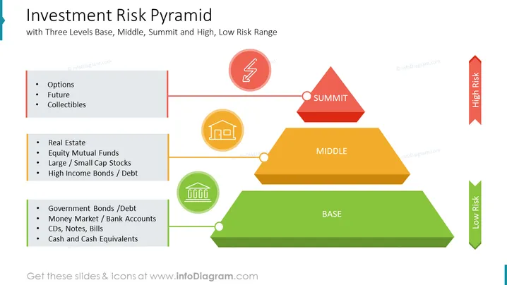
Diese PowerPoint-Folie bietet einen klaren und prägnanten Überblick über die Investitionsrisiko-Pyramide und veranschaulicht die Beziehung zwischen Risiko und potenzieller Rendite verschiedener Anlageklassen. Die Pyramide ist in drei Ebenen unterteilt – Basis, Mitte und Gipfel – die niedrige, moderate und hohe Risiken repräsentieren. Die Folie vermittelt effektiv das Konzept, dass Investments mit höherem Risiko im Allgemeinen das Potenzial für höhere Renditen bieten, aber auch ein größeres Verlustrisiko beinhalten. Diese Infografik kann in Geschäftspräsentationen verwendet werden, um Investoren über den Risiko-Rendite-Handel aufzuklären und sie bei informierten Investitionsentscheidungen zu unterstützen.
Diese Folie zur Investitionsrisiko-Pyramide ist Teil unserer Präsentationsgrafik-Vorlage für Investitionsrisiko-Pyramiden.


