

Your graphics add a nice touch to my presentations and I recently used them for one of my all-hands meetings. Your toolbox adds professionalism to my slides. Instead of using standard clipart.
Claude Jones, Director of Engineer, @Walmartlabs, USA

Your graphics add a nice touch to my presentations and I recently used them for one of my all-hands meetings. Your toolbox adds professionalism to my slides. Instead of using standard clipart.
Claude Jones, Director of Engineer, @Walmartlabs, USA
I needed a fresh look at some of my slides. I've tried to find a way to create a paintbrush effect, to underline, accentuate, add some color and the handwritten markers were just the things. Very easy to use, easy to size, change the color. It was an affordable, perfect solution and I'm happy to recommend it.
Anonymous, US
The crisp, clean look of the graphics, and the fact that it allowed me to easily edit and change the colors to match the template was my main reason for purchasing them.
Brandie Jenkins, E-learning Developer, USA
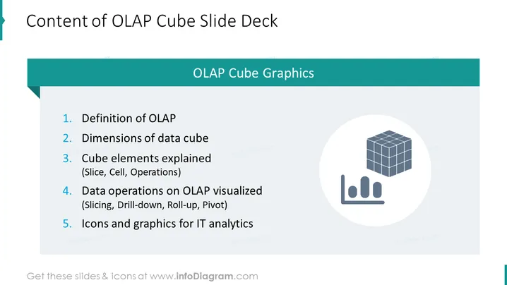
Die PowerPoint-Folie trägt den Titel "Inhalt der OLAP-Cube-Präsentation" und listet fünf zentrale Punkte zu OLAP-Cubes auf. Der erste Punkt ist die "Definition von OLAP", die erklärt, wofür OLAP steht und welche Bedeutung es in der Datenanalyse hat. Der zweite Punkt, "Dimensionen des Datenwürfels", erläutert wahrscheinlich den multidimensionalen Aspekt von OLAP-Datenstrukturen. "Cube-Elemente erklärt (Slice, Cell, Operations)" ist der dritte Punkt, der Details zu den Komponenten und Funktionen innerhalb eines OLAP-Cubes bietet, wie z.B. Slicing (extrahieren eines Teils des Würfels), Zellen (die kleinste Dateneinheit) und verschiedene Operationen. Der vierte Punkt, "Datenoperationen auf OLAP visualisiert (Slicing, Drill-Down, Roll-Up, Pivot)", vertieft die Manipulationen und analytischen Prozesse, die für OLAP-Cubes anwendbar sind. Der letzte Punkt ist "Symbole und Grafiken für IT-Analysen", was wahrscheinlich auf visuelle Hilfsmittel verweist, die genutzt werden können, um OLAP-Konzepte grafisch in IT- und Analyseberichten oder Präsentationen darzustellen.
Der Gesamteindruck der Folie ist professionell und klar, mit einem türkisfarbenen und weißen Farbschema, das guten Kontrast und visuelle Klarheit bietet. Der Einsatz von Icons hilft, die auf der Folie präsentierten Konzepte zu veranschaulichen.



