Your graphics add a nice touch to my presentations and I recently used them for one of my all-hands meetings. Your toolbox adds professionalism to my slides. Instead of using standard clipart.
Claude Jones, Director of Engineer, @Walmartlabs, USA
Your graphics add a nice touch to my presentations and I recently used them for one of my all-hands meetings. Your toolbox adds professionalism to my slides. Instead of using standard clipart.
Claude Jones, Director of Engineer, @Walmartlabs, USA
I needed a fresh look at some of my slides. I've tried to find a way to create a paintbrush effect, to underline, accentuate, add some color and the handwritten markers were just the things. Very easy to use, easy to size, change the color. It was an affordable, perfect solution and I'm happy to recommend it.
Anonymous, US
The crisp, clean look of the graphics, and the fact that it allowed me to easily edit and change the colors to match the template was my main reason for purchasing them.
Brandie Jenkins, E-learning Developer, USA
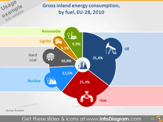
Die Folie präsentiert Daten zum Bruttoinlandsenergieverbrauch der EU-28 im Jahr 2010 nach Brennstoffart. Erneuerbare Energiequellen trugen mit 9,9% bei, was leicht unter den 10,8% von Steinkohle liegt. Braunkohle hatte den geringsten Anteil mit 5,1%. Kernenergie lieferte substanzielle 13,5%, während Gas für einen signifikanten Anteil von 25,3% des Energieverbrauchs verantwortlich war. Öl war der größte Einzelbeitrag mit 35,4%, was seine Dominanz im Energiemix dieses Jahres anzeigt. Jeder Brennstofftyp wird zudem durch ein Icon repräsentiert, was die visuelle Attraktivität erhöht und die Daten zugänglicher macht.
Die Folie nutzt ein sauberes und modernes Design mit hellen Farben, was die Informationen ansprechend und leicht lesbar macht. Die Verwendung von Icons und Prozentzahlen direkt auf den Tortendiagrammsegmenten ermöglicht ein schnelles Verständnis der Daten.


