Your graphics add a nice touch to my presentations and I recently used them for one of my all-hands meetings. Your toolbox adds professionalism to my slides. Instead of using standard clipart.
Claude Jones, Director of Engineer, @Walmartlabs, USA
Your graphics add a nice touch to my presentations and I recently used them for one of my all-hands meetings. Your toolbox adds professionalism to my slides. Instead of using standard clipart.
Claude Jones, Director of Engineer, @Walmartlabs, USA
I needed a fresh look at some of my slides. I've tried to find a way to create a paintbrush effect, to underline, accentuate, add some color and the handwritten markers were just the things. Very easy to use, easy to size, change the color. It was an affordable, perfect solution and I'm happy to recommend it.
Anonymous, US
The crisp, clean look of the graphics, and the fact that it allowed me to easily edit and change the colors to match the template was my main reason for purchasing them.
Brandie Jenkins, E-learning Developer, USA
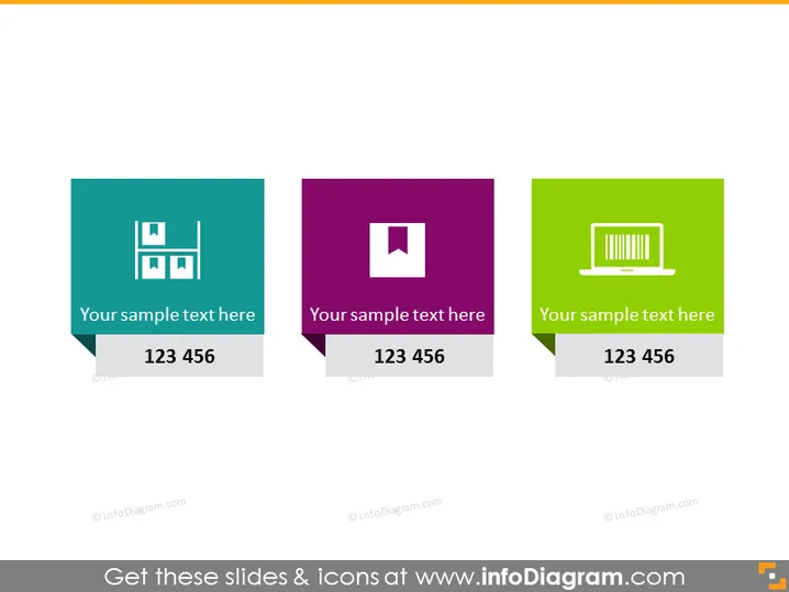
Die PowerPoint-Folie scheint drei verschiedene Elemente zu präsentieren, jedes in separaten farbigen Formen, was auf eine Segmentierung von Informationen oder eine Kategorisierung hindeutet. Jede Form enthält ein Symbol, einen Platzhaltertext "Ihr Beispieltext hier" und eine Zahlenfolge "123 456", die möglicherweise einen Schritt oder eine Statistik darstellt, die für das Thema des Symbols relevant ist. Die Symbole repräsentieren unterschiedliche Konzepte: das erste Symbol könnte Bilder oder Fotos anzeigen, das zweite deutet auf ein zentrales Thema oder einen Fokus hin, und das dritte scheint Daten oder Analysen darzustellen.
Das Gesamterscheinungsbild der Folie ist modern und minimalistisch mit einer klaren Trennung zwischen den einzelnen Abschnitten. Die kohärenten Designelemente und die Farbgestaltung erleichtern es, die präsentierten Kategorien zu unterscheiden.


